Badges
Best Practices
Overview
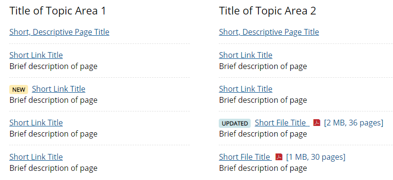
A badge is a temporary visual element that can be used to indicate new priority content or to indicate when existing priority content has been updated. Each badge displays next to a link for two weeks. After two weeks, the badge disappears but the associated link remains.

General Guidelines
Badges can be used in list modules, navigation buttons, and card sections, and textbox modules.
- Add a badge only before link text or the module title field.
- Use badges sparingly (no more than a few on a page) and only for priority content that needs to be promoted or elevated.
Badges should NOT be used in the following components, modules, or content areas.
- Headings or titles of topics / sections
- Buttons (not to be confused with navigation buttons)
- Badge InstructionsSee key tips and guidelines for adding badges to elements in the WCMS.
- TP4 UX Best Practices [PPT - 14 MB]For general guidance on colors, layouts, and overall presentation, see this overview of TP4 best practices.
Badges in lists must be added to an individual list item before the link.

Badges in Navigation Buttons must be added before the title text.

Badges in Text Box Modules must be added to the beginning of the Body text, or used for individual features with one link only.
