Line Chart
Best Practices
Visit the new and updated Gallery!
Overview
The primary use of a line chart is to reveal trends or progress over time for a variety of categorical data. Multiple data series can be plotted on the same line chart, which is a particularly useful feature for analyzing and comparing the trends in different datasets. Click the link to navigate to the example at the bottom of this page:
- Standard Line Chart
- Standard Line Chart with Region
- Standard Line Chart with Isolated Lines on Load
- Standard Line Chart with Different Line Weights
- Standard Line Chart with Open Circles or Special Lines
- Standard Line Chart with Suppressed Data
(If you need a mix of line styles — for example, a dashed line for one data series and solid lines for others — use a combo chart.)

- Building in the WCMSSee key tips and guidelines for working with line charts in the WCMS.
- TP4 UX Best Practices [PPT - 14 MB]For general guidance on colors, layouts, and overall presentation, see this overview of TP4 best practices.
Interacting with the labels in the legend will highlight or isolate the selected data series. Each data series can be toggled on and off individually, allowing users to view a wide variety of combinations.

Sorting: Selecting the top row of a column will sort the entire table by the content within the selected column. Selecting the same column multiple times rotates the sorting feature between 2 different states: Descending and Ascending. Only a single column can be sorted at one time.
Source: When referencing information from outside of the current page it is highly recommended that a source link is provided. Source link text should be short and descriptive; it should not be the full URL. Source information can be added to the “Description” box under the “General” section of the “Configure” tab.

Usage
Line charts are typically used to compare changes and show trends. They reveal patterns, trends, relationships and exceptions in data values that are not readily apparent from a table of values. Time series line charts show how one or more variables vary over a continuous period of time.
Use:
- When comparing trends
- When displaying data over time
Don’t Use:
- When comparing totals
- When looking at a specific time
Other Guidance
- Chart Title: Good titles are invaluable. Your chart title should be long enough so your audience can make sense of the chart. A glance at the title should clearly convey what the chart contains. A good title requires a balance between a short title and one with enough descriptive information to clearly describe the chart.
- Number of Series Lines: Too many series lines result in visual clutter and make the chart difficult to interpret. One to four lines with a maximum of six lines is recommended. The Chart Builder will support up to nine different colored lines in a line chart. However, if you have more than six sets of quantitative values consider breaking them into multiple charts.
- Grid Lines: In most cases, both horizontal and vertical grid lines should be hidden to reduce chart clutter. Approximate values can be perceived without grid lines. When the difference in data values is close, horizontal grid lines can be shown to better support data value comparison.
- Data Source: The data source makes your graphic more reputable. It also allows those who are interested to dig deeper.
- Outliers in Series Line Data: If the data set includes an extreme outlier(s) then the visualization will be difficult to process. If the variation can only be seen on a single bar and the rest are flat then it is recommended to do one of the following: Modify the data set to remove / adjust the outlier issue, split the chart into multiple charts or select a different chart type.
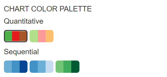
Chart Color Palettes

Standard Line Chart
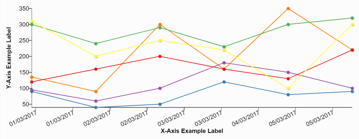
Note that the chart below demonstrates the chart animation feature. Refresh your web page to see it again. (This option is set in the admin tool’s Visual panel.) Note also that the line for Data 4 is dashed while the other lines are solid. In the Data Series panel you can set a line type for each data series. For information on setting Data Series option, see “Building in the WCMS.” See a sample CSV data file [XLS – 250 B] .
Standard Line Chart with Region Applied
The Regions feature allows you to highlight and label one or more periods of time in a time-based chart. This capability is particularly helpful for highlighting incubation periods for diseases, etc. (Configuration notes: The X axis, or Y axis for horizontal charts, must be configured with date as the data type. The “from” and “to” values must be in the same format as the data. Text and background colors are hex values.)
Standard Line Chart with Different Line Weights
Line weights have always been a certain weights, but we have received feedback that being able to adjust the thickness of lines can help users understand the data. For example, one line may be for the United States total, but other lines are for regions or states. To configure different line weights, expand the options for a Data Series in the Data Series area of the editor. If you do not see a line weight option, you may need to remove and readd the Data Series.
Standard Line Chart with Open Circles or Special Lines
If you would like to call out specific data points, you can use other columns in your data set to automatically set open circle points on your line chart. These may indicate preliminary data, low data points, or a call-out date. These options can be configured by using the Add Special Line button in the Data Series Panel. Circle and Line types can be selected in the style dropdown.
Standard Line Chart with Suppressed Data
You can suppress data in a line chart for a number of reasons, including privacy concerns or preliminary data. Use the “Add Special Line” section under the Data Series panel.
Please note that for best results, and because users can download the raw data, you will want to use text to suppress the data in your dataset (replaced suppressed values with “SUP” or “ABC” or something similar), rather than just relying on suppressing by numeric value. See example data file [XLS – 443 B].