Newsletters
Overview
Creating a web page for a newsletter helps users see the types of content that are typically included in an email newsletter and encourages subscriptions.
Keep in mind, that most users will likely read the newsletter via email and are less likely to read on the website, which means that the web version of the newsletter should not be the primary means of delivery.
Newsletters work well when the goal is to provide updates to users that will encourage usage of your web content / resources.
Template types
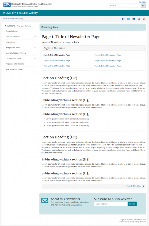
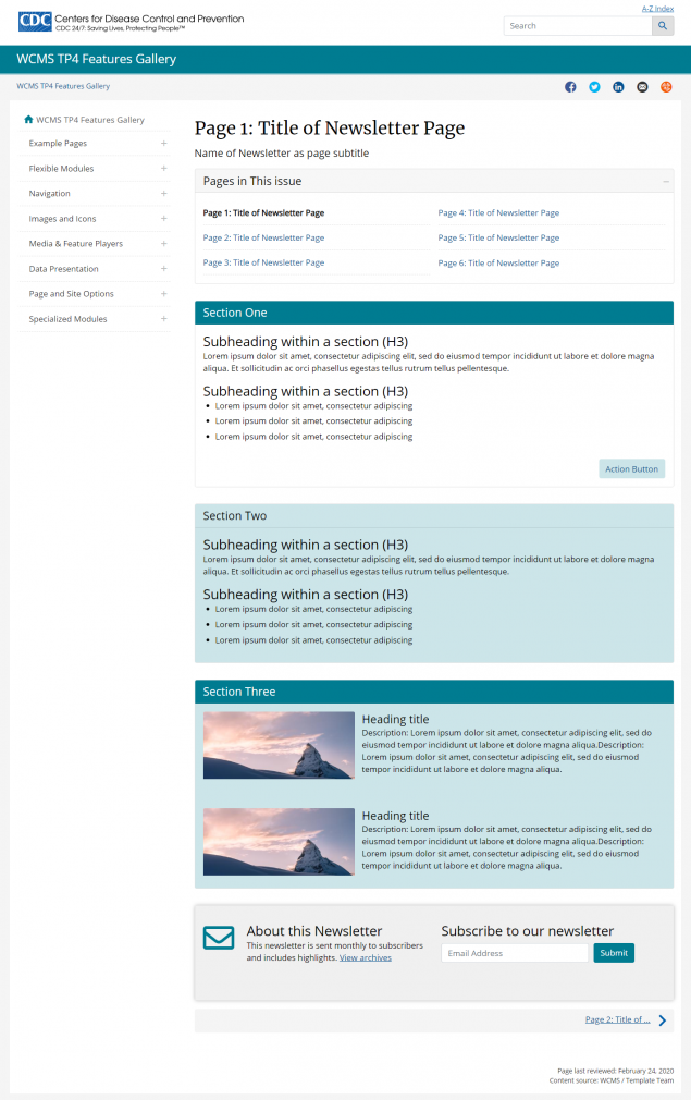
Each of the templates provided include the above building blocks in different ways to help you develop a newsletter web page.
In addition to the building blocks, two different types of templates have been used:
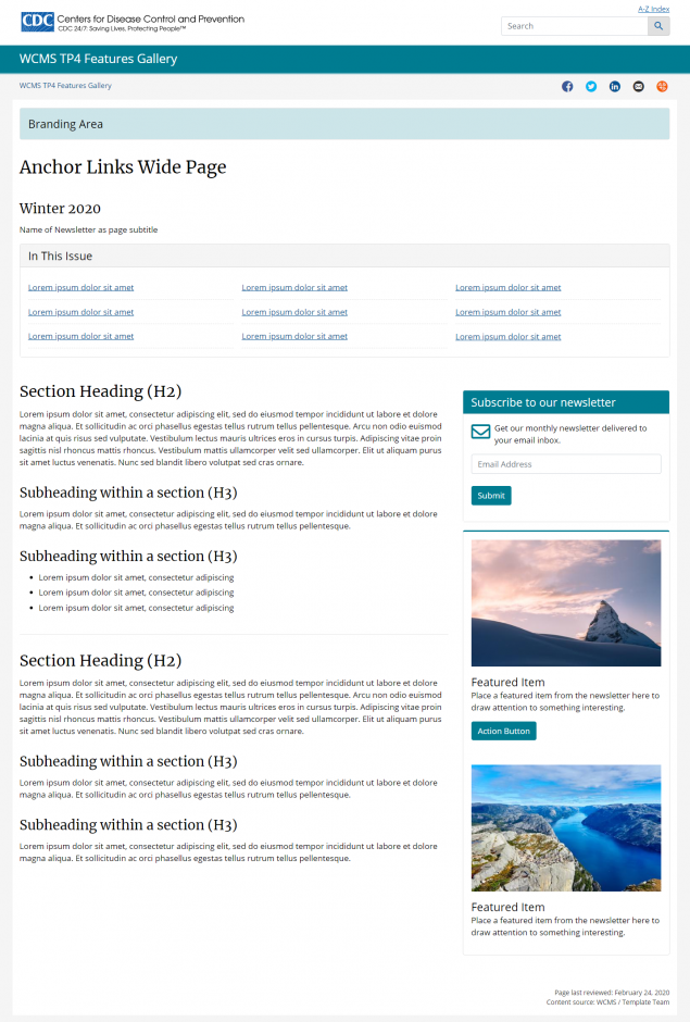
Wide template:
Consider using a wide template if the web page is used as the primary destination for your email. It can also be helpful to use the wide template when you have large graphs or images.
Keep in mind, that it is helpful to add highlighted items on the right side of a wide template as the line length of the wide template far exceeds optimal reading length.
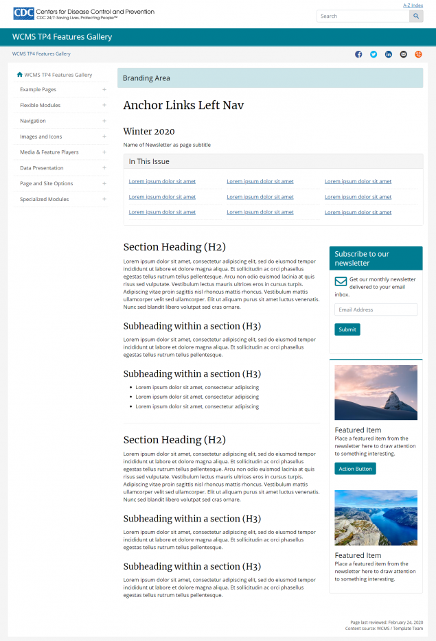
Standard content page with left nav:
Consider using a standard content page with left nav if you want users to discover your newsletter while browsing your website and to subscribe. It can also be helpful to use the standard content page if your newsletter links to many of the other pages in the left nav so that users can easily browse your website.
Email newsletters
The guidance found in this document is specific to the web template provided for newsletters. It does not include best practices to use when writing compelling emails that will result in higher open and click through rates.
Web template for newsletters
To help programs who create web pages for their newsletters, a set of web templates have been created. Since newsletters vary so widely across CDC, none of these templates is likely to be a one-size-fits-all solution.
Instead, each template provides basic building blocks or components of what we believe is a successful web template for newsletters.
Key building blocks
Following is a list of components or building blocks that each of the templates contain to help you build a successful web page for a newsletter.
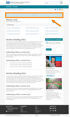
Visual element:
The Visual Element appears at the top of the page above a page title. The Visual Element can help brand your newsletter and tie together multiple pages, if you choose to use the multi-page module.
Page Title:
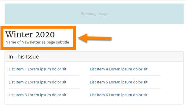
When adding a page title to your page, consider using the date of the newsletter or title of the specific issue as the page title.
Subtitle:
When adding a subtitle to your page, consider using the name of the newsletter as your subtitle.
When designing navigation for a newsletter, consider one of the two options below.
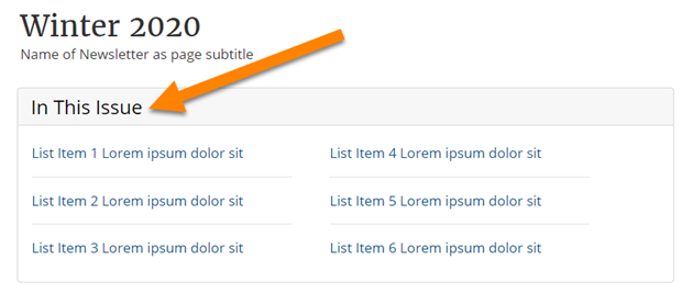
On this page:
Adding “on this page” navigation can help users quickly jump to the sections that interest them most. We recommend changing the label of the “on this page” module to “In This Issue” when adding this to a web page for a newsletter.
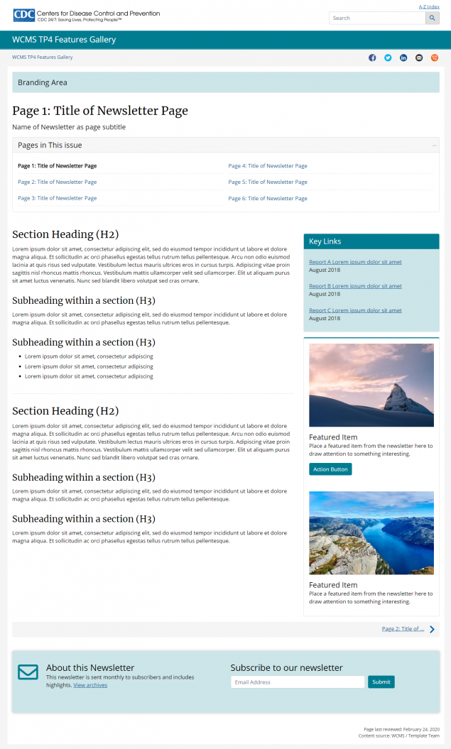
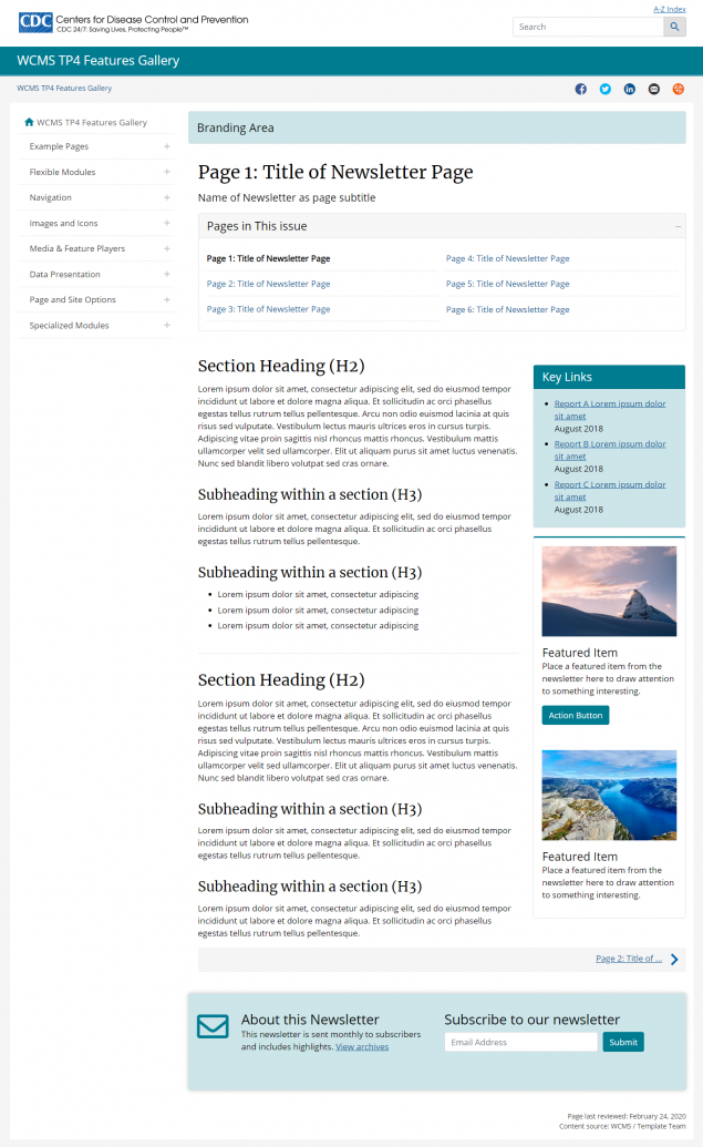
Multi-page module:
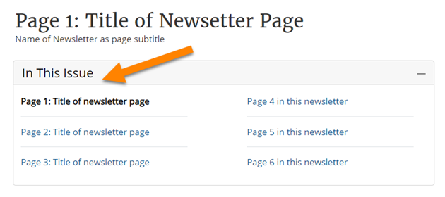
Adding “multi-page” navigation can help to tie together multiple pages of a very long newsletter. Multi-page modules should only be used when a newsletter is extremely long and cannot realistically be presented on a single page.
We recommend changing the label of the “multi-page” module to “In This Issue” when adding this to a web page for a newsletter.
Content separators:
Content on a typical web page tends to have a linear flow, whereas, content in a newsletter tends to include bits and pieces of information that highlights different items.
As such, the content in a newsletter tends to have sections or blocks of information that are uniquely different from each other or address entirely new topics.
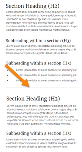
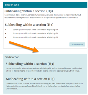
To help users more easily scan content and transition from one section to another, it is recommended that you add content separators between blocks or sections of content within a newsletter.
Content is primarily separated in one of two ways:
- Horizontal rules which may be added to divide sections of content
- Cards which may be used to create containers to section off different blocks of content
Email Sign-up:
Consider adding a way for users to subscribe to your newsletter by placing a module on the right side of the page or in the persistent content area of the page.
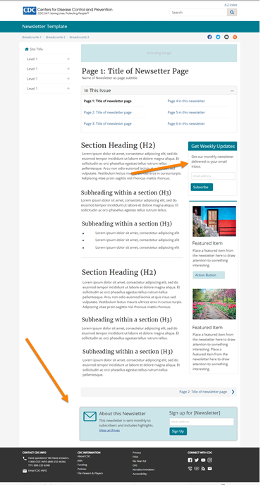
- Use the visual element to help brand your newsletter.
- Use the page title and subtitle together to display the date/issue number and title of the newsletter.
- Use “on this page” or the “multi-page” module to help users navigate to content.
- Use content separators with horizontal rules or cards to help separate content blocks or sections.
- Provide a way for users to subscribe to your newsletter from the web page.
- Re-create your email newsletter on the web. The same designs that work well in email may or may not translate into a well-designed web page.
