Markup Includes
Building in the WCMS
Overview
The Markup Include visualization allows you to add an existing SSI into a Data Visualization dashboard. This was created so that textual information and imagery can be added to a dashboard, independent of the data that the dashboard is created from. Design elements can be added this way as well.
This element can be used to help the page user understand how to interact with the dashboard or interpret it. These elements are best applied to subsections of the dashboard needing context or overall dashboard guidance. If a single data visualization needs subtext, that can be added within the data visualization itself.
Markup Include Best Practices can be used to inform the content owner about best practices and module options during page planning.
Note: Markup Include can currently only be used within a dashboard. Purpose-built single-use or reusable WCMS modules like a Text Box Module or an Image Module should be used as a stand-alone element on a page if a data visualization dashboard is not being used.
Data Requirements
There are no data requirements to build the Markup Include itself. But, be aware of the dashboard’s data requirements and required fields.
Creating the Markup Include
- From the WCMS content browser, select “New Content” and then select “Data Visualization” (under “Media and Visualizations”) as the content type.
- Enter a title and a file name ending in .JSON.
- Then click “Open Visualization Editor” and complete the fields in the importing data section.
- When prompted to “Choose Visualization Type” select Dashboard.
- From the available visualization elements, drag and drop “Markup Include” into an available dashboard slot.
Inline styling can be added to the title text.
You can use either the tabs along the top of the visualization editor or the blue navigation buttons within each tab to progress through the building process. The “OK” button closes the editor.
Published changes to a Markup Include Visualization or associated SSIs will reflect on any page that includes it without re-publishing the destination page.
Importing Data
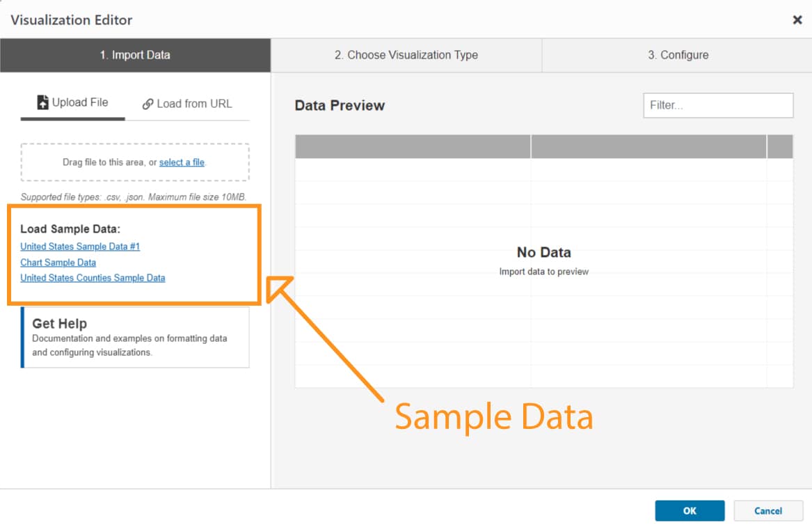
In the import data tab, use the data source options that are appropriate for the dashboard you are creating. Again, if you are creating a standalone Markup Include, you can use the sample data that is available at the links below the Data Source field.
On the “2. Choose Visualization Type” tab select the “Dashboard” or “Markup Include” visualization type and you will automatically go to the “3. Configuration” tab.

Configuration

General
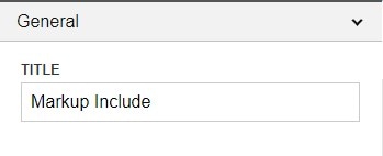
- Title – Any Text entered here will display in the Markup Include title bar above the visualization. Most inline styling can be applied to the title. If not title is desired, simple delete out the example text and leave the title field blank.

Content Editor
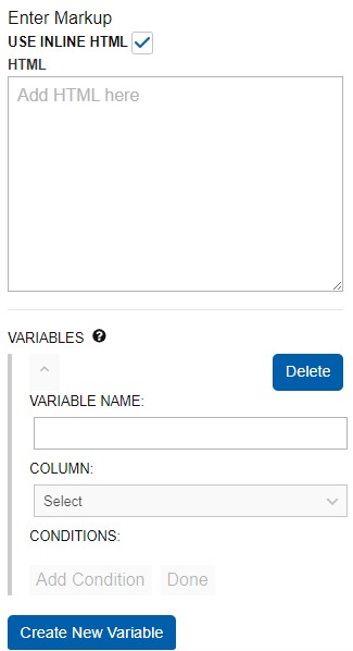
- Use Inline HTML – Use HTML to create markups directly in the module without needing to create a separate SSI module. If you have associated this Markup Include module with a dataset, you will also have access to the “Create New Variable” button. To create a variable, give this variable a name and select a column to draw from. Add any relevant conditions. Click “Done.” To put the variable in your HTML markup, enclose the variable name in curly/mustache brackets ({{Name}}). The name is case-sensitive and will highlight yellow in the preview when it has been successfully configured.
- Source URL – Toggle off “Use Inline HTML” to access the Source URL. The URL path listed at the top of any existing SSI module in the WCMS can be copied and pasted into this field. The URL for a sample SSI to use is: /wcms/4.0/cdc-wp/data-presentation/examples/SSI-Image-With-Text.html

Once the URL is added you can click the “I’m Done” button to see the rendering of the SSI in the preview window with any title that you’ve included.
Note: The SSI Module must be published to DEV and/or LINK in order for the Markup Include to reference it outside of preview.

Visual
Once your data bite configuration is complete, you can change design elements such as font size and color palette in the “Visual” Tab.
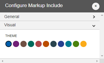
- Theme – This selection changes the color of the Title bar. This is independent of the site and dashboard settings. It is recommended to use a select few colors within the dashboard titles and visualizations to conserve visual coherence.