Sparkline
Building in the WCMS
Overview
Sparklines are very similar to line charts but with less detail and therefore fewer configuration settings to consider. As with a line chart, you must define both a data series and a data key for the date/category axis.
Important notes: The tool currently allows the selection of multiple data series, but you should limit your sparkline to a single series. Also, you may find that the current Visualization Editor displays configurations options that do not apply to sparklines. A fix is planned, but until the fix is in place, the guidance below can help you focus on the key options to consider.
Preparing Chart Data
Each WCMS chart requires a data file or a URL to a data set. The data must be in CSV or JSON format. Sample data files are available:
JSON Source Data Example [JSON – 407 B]
CSV_Source_Data_Example_Line [XLS – 250 B]
Tip regarding special characters: Data files containing special characters such as “=” and “>” are currently not supported. Excel files containing formulas will convert into final calculated values.
Note regarding instructions below: These instructions are for line chart creation with the new data visualization editor. Instructions on the old charts content type are still available.
Creating the Chart
From the WCMS content browser, click the blue “+New Content Item” button in the top right of the window and then select “Data Visualization” when prompted. Once the new visualization has opened, click on the “Open Visualization Editor” button in the middle to begin work on your chart.
Choosing Visualization Type
The first step is to select the type of visualization you want to develop.
- A new Visualization Editor window will open on the “Choose Visualization Type” tab.
- On this tab, select the type of visualization you want by clicking on the icon for that type. (Note that sparkline is not currently listed on this tab. Choose Line Chart and then, when configuring the chart as instructed below, change the Chart Type to “Sparkline” in the General tab.)
- Once you select your visualization type, you will be taken directly to the next tab, “Import Data”.
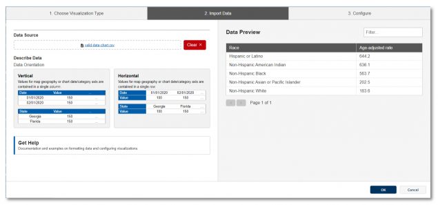
Importing the Data
Note: The visualization editor has sample data that can be selected, allowing you to experiment with the various configuration options. This example data can be loaded into the editor by clicking the hyperlinks.
- You can Import data in one of three ways:
- Drag and drop a supported data file into the area marked with a document icon
- Select a file from your computer using the blue hyperlink.
- Load data from a URL by selecting “Load from URL” (Note that if you select Load from URL, you can also check “Always load from URL” to keep the chart data in sync with the data source.)
- If formatted correctly, your data will populate in the “Data Preview” on the right. If the editor detects issues in the file or file type, a warning box will appear under file area with the detected issue.

- Select the Orientation of your data as either Vertical or Horizontal.
- If your data is horizontally listed or has multiple data series represented, you may need to make additional selections in the data orientation options below the data import fields before progressing to the Visualization Type. Simply select the options that best fit your data.
- Click on the “Configure your visualization” button that appears after those selections are made. This will take you to the “Configure” tab.
Configure the Visualization
General Options
In the General tab, make certain that “Sparkline” is selected as the Chart Type.
Enter the title and other supporting text necessary to provide context. (Text elements are optional. Context can be provided outside the visualization component.) Remember to keep text as brief as possible so that it does not overshadow the visualization.
Data Series
In the Data Series panel, select one data series. (The tool currently allows you to select multiple series, but the sparkline does not include a legend, so you should select only one.)
For more information on data series, see the subtopic “Data Series” in Common Configuration Settings for Maps and Charts. (Note that this document provides a lot of useful information on maps and charts. We recommend that you become familiar with its contents.)
Date/Category Axis
In the Date/Category Axis panel, you should typically select Date as the Data Type and then select the source data as the Data Key. (When data points are not in standard date formats — e.g., Quarter 1, Quarter 2, etc. — select Category as the Data Type.)
Remember to set the Parse Format and Display Format for the dates.
If you need to limit the dates to a subset of data points, select the Limit by Start/End Dates option and then enter the start and/or end dates as appropriate.
For more information on setting up the date/category axis, see the subtopic “Date/Category Axis Settings” in Common Configuration Settings for Maps and Charts.
Visual Settings
In the Visual panel, set the display options such as color, font size, etc.
Finalization
Once configuration is complete, click the “OK” button in the bottom right of the window to exit the editor. BE SURE TO SAVE YOUR PROGRESS before you leave the data visualization page.
The chart can now be added to your page like any other data visualization. When the page is published, you’ll be prompted to publish the visualization modules as well.
If sparkline is not available on the Choose Visualization Type panel, you can select it during configuration (General panel).
A sparkline should have only one series selected in the Data Series panel.
Only three configuration panels are required for creating sparklines: General (to ensure the correct Chart Type is selected and to enter any text elements), Data Series, Date/Category Axis. Visual settings are optional.