Dashboards
Building in the WCMS
Overview
A successful dashboard incorporates multiple visuals to provide different perspectives on a single theme. Adding the right combination of visualizations can provide a cumulative effect that one visualization cannot. Data filtering across the separate elements adds a level of customization to the viewer’s experience. Dashboard Best Practices can be used to inform the content owner about available elements and options during page planning. As you plan, the complexity of your dashboard may grow. Please feel free to reach out to our team through your WCMS POC to request a consultation.
The WCMS dashboard is a reusable module that can only be added in the Visual Composer.
Be sure to save often! While building your dashboard in the visualization editor, you can click the “OK” button in the lower right of the editor window to go back to the module screen. It is here that you save. If you navigate away from the module without saving your changes, they will be lost. Also, frequent saving can help in reverting a dashboard if a mistake is made in the configuration.
Building a Dashboard in the WCMS
With the ability to add multiple data sources and more configuration options for your visualization, having a pathway through the build process is important. The recommended workflow is listed below, though your center may develop its own process. This serves as a guide with insight into some of the configuration options available to you. The high level steps are listed below. Each of those steps are described in detail below the summary section.
With the increase in complexity and variety of visualizations available, it is essential to know the health communication goals for your dashboard.
Structuring your data is even more important in a dashboard than a stand alone visualization. Dashboard filtering requires common sections within your data sets. The number one support issue we see with dashboards involves data configuration.
There are many ways to approach building a dashboard in the Data Visualization Editor. We’ve provided a process below that will add consistency and stability to your build.

It is important to decide with your team if a dashboard would be a successful tool for communicating your message. Answering the questions below can help you determine the structure and which visualizations to include in a dashboard:
- What do you want your audience to know?
- What type of visualizations best tell the story?
- What filtering will you make available to the page user?
- How will the visualizations all work together to inform the public?
Knowing the answers above will make the dashboard more effective as a communication tool. You could simply add some data and improvise your dashboard. Taking time to plan ahead for each of those visualizations, filters, and structures will make development process go much smoother. Having a mental, or even sketched out, wireframe of your dashboard is highly recommended until you are familiar with the dashboard capabilities.

To create a dashboard, you need at least one CSV or JSON file containing a record for each of the entities to be included. Multiple data sets can be loaded into the dashboard. You will be prompted to select which data set to use as you add each visualization in the dashboard. When formatting your data, keep the end dashboard in mind to guide data configuration choices. Some considerations you may need for your data sets are:
- Not all data will lend itself to a dashboard
- Support for filterable data is available in the dashboard editor
- Each visualization you add will have unique data configuration needs (Each visualization gallery page will list their unique data configuration needs)
- Filterable Maps will need multiple records for each geographic entity
- If you are using multiple data sets, any shared dashboard filters will require an identical column for that filter in each data set. For example, If you are filtering by State for a Map and a Bar Chart using two different data sets, then there must be a column in each data set containing “State” information with the same heading
Example CSV files and specific data requirements for each visualization you may want to add to your dashboard are available for download at each of the individual data visualization build pages.
Example dashboard CSV files that share common data filters are included below:

Creating the Dashboard
-
- From the WCMS content browser, select “New Content” and then select “Data Visualization” (under “Media and Visualizations”) as the content type.
- Enter a title and a file name ending in .JSON.
- Then click “Open Visualization Editor” and select “Dashboard” from the General visualization options.


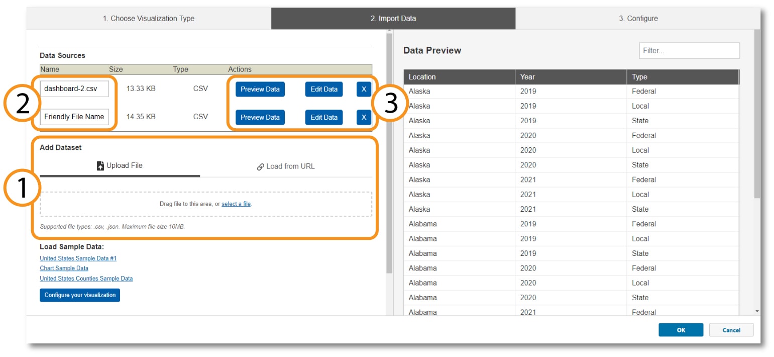
The “Import Data Tab” is where all your data is entered for your dashboard visualizations. There are 3 key sections you’ll be interacting with:
- Add Data Set – Select “Upload file” or “Load from URL” to add a data source to your Dashboard. When loading from a URL, you can check “Always Load from URL” to keep the data in sync with the source data. This causes the map to load from the URL endpoint each time it is rendered. Note: If a URL is used, the host of the URL must be set to allow for cross-domain web requests.
- Data Sources File Names – You can leave the file name as the name of the data set, or you can enter a friendly file name that will be associated with that data set. This name will show in the data selection fields within the editor.
- Data Sources Action Buttons – These buttons allow you to manipulate and view the data sources
- Preview Data – Shows the data set in the preview window
- Edit Data – Allows you to change the data source between files or links
- X – Removes the Data Source from this visualization
Once the data sources are loaded and confirmed, click the “Configure your visualization” button at the bottom of the data sources window.

Filters can be configured to give a page visitor the ability to customize their view at the dashboard-level. Note: When a filter is created here, it affects the logic of all elements within the dashboard. It is recommended to configure the dashboard-level filters first.

The “Configure” tab is where you will be doing most of the work for building your dashboard. You can follow many different workflow options through this build process, but we recommend starting with your filters. As you’ve already planned the interactions your users will have, the filters can be completed in one step. Additional filters may be added and edits can be made throughout the build process, but getting these set early will help with stability and make the editor easier to use.
Making a Filter and Configuring it:
- Click on the “Add New Filter” button to generate a filter.
- Click on the blue text of that filter that was generated to open the filter editing window.
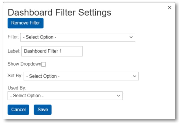
There are two parts to configuring your filters: Pre-Visualizations and Post-Visualizations
Configurations you make to your dashboard filters Pre- Visualizations:
- Filter Dropdown – This is populated by the column headings from your data sources. This sets what part of the data that will be displayed after the filter is applied.
- Label – Entering text into this field tells the user what the filter is targeting. Short labels are usually best.
- Show Dropdown – This will either show or hide this filter selection. If you want the filter to be static and not viewable by the user, leave this unchecked.
Once you’ve added your visualizations to your dashboard you will return to your filters and make the following selections Post-Visualizations:
- Set By – You can set a data map to filter visualizations by what state is selected by the user. This drop down assigns which map to use for that function.
- Used By – Selecting visualizations from this dropdown will apply the filter to the data displayed by that visualization.
By default, each visualization will be assigned an identifier that includes the type of visualization and a unique set of numbers. That identifier can be difficult to use to identify which visualization to apply a filter to. Entering text into the title field of a visualization makes that title display in any filters you're configuring. You can add titles to each of your visualizations while configuring your filters and remove the titles you no longer want to display after that configuration is done.

Adding visualizations to the dashboard layout is as simple as dragging a visualization tile from the options on the left into the grid on the right. Additional rows can be added using the “Add Row” button along the bottom of the layout window. Options for column configuration and ordering of the rows are found along the top of each row in the grey tabs that turn blue when you hover over a row.
Once you drag a visualization into the layout, you will be prompted to select the data set you want to associate with this visualization.
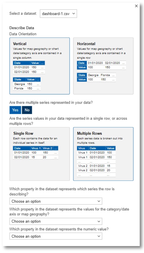
For most visualizations in a dashboard, selecting the orientation of your data (Vertical or Horizontal) will suffice. If you're planning on applying dashboard level filters to your visualization, then select "No" to the question of multiple series being represented in your data.
Once you select the data source from the dropdown, the data configuration window expands as you make selections. For most visualizations in a dashboard, selecting the orientation of your data (Vertical or Horizontal) will suffice. If you’re planning on applying dashboard level filters to your visualization, then select “No” to the question of multiple series being represented in your data. If your specific configuration requires it, select yes and answer the questions below:
- Single Row/Multiple Rows? – Use visual of the data to help you decide which option is best
- Which property represents the series? – Select the column header that contains the description of the data (type of virus, type of vaccine)
- Which property represents the category/date or geography? – Select column header that has the type of information the question describes. (State, Date of infection)
- Which represents the numerical value? – Select column header contains the information you want to plot. Usually this is a numbers column.
Once you’ve clicked continue to exit the data configuration window, you can return to each visualizations data configuration by clicking on the gear icon inside each visualization in the dashboard layout view.

Once you’ve added the data visualizations to your dashboard, it is time to apply the dashboard-level filters to your visualizations. To do this, return to the Filters section at the top of the editor. Clicking the title text in the filter pill for each filter opens the filter configuration window. Complete the following for each filter as appropriate:
- Set By – You can set a data map to filter your dashboard by what state is selected by the user. This drop-down assigns which map to use for that function.
- Used By – Selecting visualizations from this dropdown will apply the filter to the data displayed by that visualization.
Now that the filters have been assigned, when you go to configure the individual visualizations there will only be data you’ve filtered to that visualization. Also, if there are multiple data sets for that particular visualization, the dashboard-level filters will handle the data instead of configuring the data on the individual visualization level.

With the dashboard-level filters configured, the visualization configuration is next. You will see red “Needs Configuration” text in each of the visualizations in the dashboard that need to be configured. To enter the configuration, click on the crossed tools icon for that visualization. Each type of visualization has unique configuration needs. Configuration guides can be found via the build page for each in this gallery. For ease of use, here is a link to the Visualization Gallery Main Page. Some overall guidance for configuring visualizations:
- Remember that dashboard-level filters you created influence the data available to the visualization and the visual output.
- If you make configuration selections that result in the editor displaying an error, click on the “Import Data” tab and return to the dashboard configuration.
- Save often. Click the “OK” button near the bottom right of the editor to exit and save. If an error is made, you can simply refresh the page and it will load from the last saved state. Though, you will loose any unsaved work.
- Use the drag and drop function in the dashboard layout to move visualizations to different positions in the layout. This is especially helpful if the visualization you create does not visually fit where you originally placed it.
- Make Data Table selections in the dashboard-level options.

Though they’re listed at the bottom of this document, these dashboard-level options can be used at any time in the development process.

- Enter Dashboard Name Here – Entering information in this field will display along the top of your dashboard in a title box. Leave this field blank if no title is desired.
- Dashboard Description – Text entered here will display under the title along the top of the dashboard and above the dashboard-level filter selections. This text field accepts HTML inline markup. This text is ideal for explaining the dashboard’s filters and use. Additional text can be entered inside the dashboard using the HTML Markup module.
- Dashboard Filters – The use of this section is described in the Filters sections above.
- Data Table Settings – Make data table selections appropriate for your dashboard here. Consult a UX or Compliance specialist for best practices.
- Dashboard Preview – Selecting this switches the editor view to a preview of the current state of your dashboard. Click on “Dashboard Description” to return to the layout view.
Finalization
Once configuration is complete, click “Ok” in the bottom right of the editor window to take you back to the module settings page. BE SURE TO SAVE YOUR PROGRESS before you leave the data visualization page.
With the Dashboard complete it can be added to your page like any other Data Visualization Module. When the page is published, you’ll be prompted to publish the module as well. As a reusable module type, this dashboard can be added to any page on this site.