Combo Chart
Building in the WCMS
Overview
Once you have your data formatted and imported into the WCMS, the essential steps to configuring a bar chart are as follows:
- Set up the data series.
- In the Value Axis panel, enter a label for the value axis.
- In the Date/Category Axis panel, select the variable set that will be the basis for the axis.
- Also in the Date/Category Axis panel, enter a label for the axis.
- If the source data are filterable (e.g., by demographic group), set the filter options in the Filters panel.
Beyond that, it’s a matter of entering the text elements in the General panel and setting various options to fine-tune the display. This document will help you identify the key configuration properties.
Creating the Chart
- From the WCMS content browser, select “+New Content” and then select “Data Visualization” (under “Media and Visualizations”) as the content type.
- Enter a title and a file name ending in .JSON.
- Then click “Open Visualization Editor” and complete the fields in the following sections.
Choosing Visualization Type
In the Visualization Editor, from the tab “Choose Visualization Type,” select Bar Chart. In the Configuration tab, General panel, you will be able to specify “Combo” as the Chart Type.
Importing Data
That source data must be in JSON or CSV format.
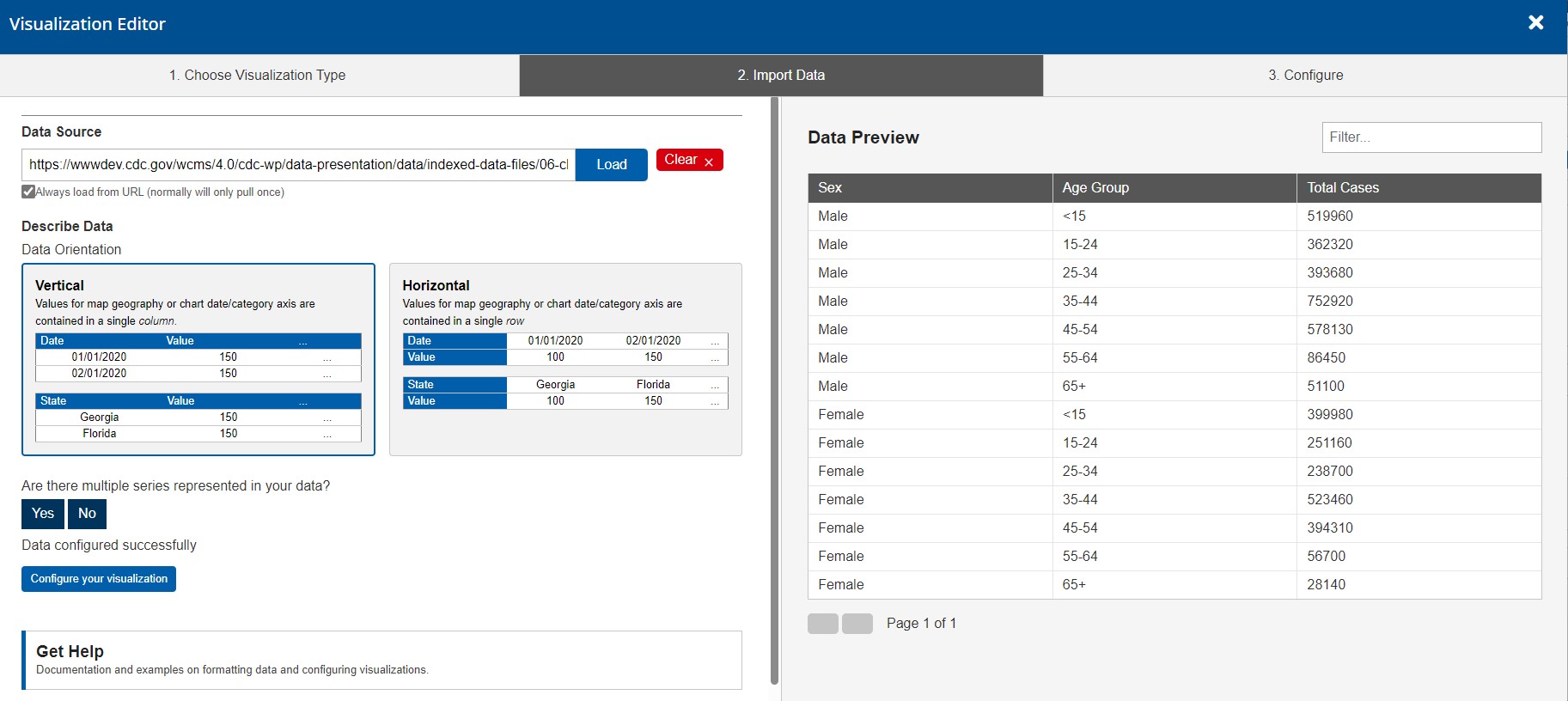
In the import data tab, select “Upload file” or “Load from URL.” When loading from a URL, you can check “Always Load from URL” to keep the visualization in sync with the source data. This causes the data to load from the URL endpoint each time the visualization is rendered. Note: If a URL is used, the host of the URL must be set to allow for cross-domain web requests.

Once the import has completed successfully, you can preview the data in the table on the right. If the data looks correct, click “Configure your visualization” to proceed.
Configuration
Each data series in a combo chart has special configuration options. Once you select a series in the Data Series panel, click the series label to see its options.
Don’t forgot to apply labels for the X and Y axes. For combo charts, these may be critical for easy-to-follow on-hover pop-ups.
Be careful not to overdo the mix of visualization styles. For more information, see the best practices for combo charts.
General Settings
In the General panel, ensure that Combo Chart is selected for the Chart Type.
Also set text elements as necessary to describe the chart, its data source(s), and other information of value to end users. For more information, see the topic “General Settings” in Common Configuration Settings for Maps and Charts.
Note that if you have more than one data series that you are configuring as bars, you can select “Stacked” as the Chart Subtype.
Data Series
In the Data Series panel, select each series from your source data that should be represented in the chart. For combo charts, there are special options available for each series, such as the visualization style (bar, line, etc.) and the axis assignment (left or right) if you are creating a chart with two value axes. (The screen capture on the right shows the expanded options for a series called “New Participants.”) Click a series label to see and set its options.
For more information on data series configuration, see the topic “Data Series” in Common Configuration Settings for Maps and Charts.


Value Axis
In the Left Value Axis panel, set the format for the Y axis. In particular, pay attention to these fields. Make certain your Y axis is clearly labeled. For some chart types, the label displays in a tooltip when a user interacts with the chart. If you are using a Right Value Axis, ensure the settings are completed in that panel also, including a clear label.
For more information, visit the topic “Value Axis” in Common Configuration Settings for Maps and Charts.
Date/Category Axis Panel
This panel is where you set up the X axis. The primary fields are the Data Type, Data Key, and Label.
For combo charts, the Data Type is typically Date or Category. (The “Continuous” data type applies to specialized chart types like scatter plot.) The Data Key is the set of variables upon which the X axis is based. Unlike the Data Series, you can select only one variable set as the key. If one variable set is clearly independent of the other, you should select that set for the X axis.
Note that, if you select Date as the Data Type, you must specify the Date Parse Format (i.e., the date format in the source data). You also have the option of specifying a different Date Display Format.
For more information, including date formatting, see the topic “Date/Category Axis” in Common Configuration Settings for Maps and Charts.


Filters
If your source data are filterable, don’t forget to visit the Filters panel to set up filter controls for end users. For example, the source data illustrated below has an attributive “Sex” column that can be used for filtering. The screen capture on the left shows the configuration of Sex as a filter property. With this configuration, end users can filter the data based on whatever values are in the Sex column. For more information, see the topic “Filters” in Common Configuration Settings for Maps and Charts.

Other Configuration Options
There are many options available for fine-tuning your visualization. Visit Common Configuration Settings for Maps and Charts for more information.
Finalization
Once configuration is complete and you have tested the interaction with the chart, click the “OK” button in the bottom right of the window to exit the editor. Be sure to save your progress before you leave the data visualization page.
The visualization can now be added to your page like any other data visualization module.