Data Bite
Building in the WCMS
Overview
A data bite aggregates numbers within a data set using calculation selections you make in the editor. It then displays that number with either a graphic or an image. The calculations and filtering are handled within the visualization natively. When used inside a dashboard, data bites provide calculated summary information that reacts to dashboard level filtering as an interactive page element. Data Bite Best Practices can be used to inform the content owner about best practices and module options during page planning.
As a reusable data visualization module type, data bites can be placed on pages across a site and updated in a single editor.
Data Requirements
To create a data bite, you need a CSV or JSON file containing at least one piece of numerical data. Data bites aggregate numbers found in a single column of your data file. The calculated numbers can be filtered further in the editor. Only cells containing numbers can be calculated, you may add prefixes and suffixes to your data in the editor during the build process. Commas should be removed from the data; they may be added while building the data bite in the editor.
If a data bite is built in a dashboard visualization, the data needs to meet the overall dashboard requirements. This is because one data source drives the entire dashboard.
Example Data Bite CSV file:
Creating the Data Bite
- From the WCMS content browser, select “New Content” and then select “Data Visualization” (under “Media and Visualizations”) as the content type.
- Enter a title and a file name ending in .JSON.
- Then click “Open Visualization Editor,” select Data Bite as the visualization type, and complete the fields in the following sections.
Importing Data
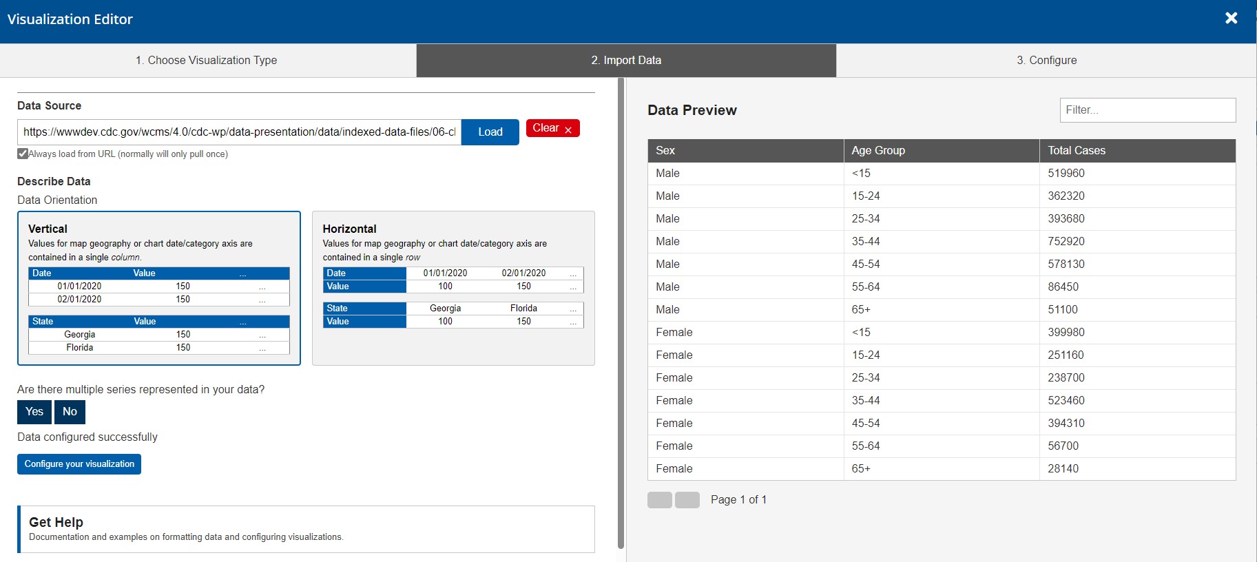
In the import data tab, select “Upload file” or “Load from URL.” When loading from a URL, you can check “Always Load from URL” to keep the data bite in sync with the source data. This causes it to load from the URL endpoint each time it is rendered. Note: If a URL is used, the host of the URL must be set to allow for cross-domain web requests.

Once the import has completed successfully, you can preview the data in the table on the right. If the data looks correct, click on the “3. Configuration” tab or “Configure your visualization” button to proceed. You may use the data orientation wizard below the data source to aid in configuration, but it is not required for data bite use.
Configuration
Inline styling can be added to the title, message, and subtext of the Data Bite directly in the input fields.
The Data Bite visualization can calculate numbers like the sum result without that formula existing in the data file.
You can use either the tabs along the top of the visualization editor or the blue navigation buttons within each tab to progress through the building process. The “OK” button closes the editor.
Look for feedback from the visualization editor throughout the process to guide choices and troubleshoot errors.
Published changes to a Data Bite Visualization will reflect on any page that includes it without re-publishing the destination page.
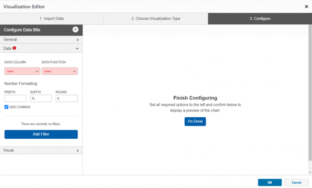
Your data selections must be configured in the “Data” tab before your data bite will render in the preview window to the right (the red exclamation and highlighted dropdowns are the required fields).


General
- Data Bite Style– This drop-down sets the way the calculated number will display with its: graphic, value above message, or value before the message.
- Title– A descriptive title will guide user perceptions and queue users to how data was calculated.
- Message– This text provides context for the calculated number. For the best visual result, use less than six sentences to summarize the message.
- Subtext/Citation – Providing the source of the data can add credibility. Any text added here displays at the bottom of the Data Bite box.
Note: Most inline styling can be applied to the Title, Message, and Subtext portions of the data bite text. This markup can be added in each text field to create variations in the text such as italics, underlining, and bold. Inline markup will reflect in the data bite preview.
Data
The “Data” tab is used to select what numbers are used in the calculation. Each selection refines the numbers further. This allows a specific set of numbers to be used from a possibly large data set.
- Data Column – This drop-down allows you to select the column that has the numbers you want to calculate.
- Data Function – Select the mathematical function to apply to the numbers you’ve targeted. This calculation occurs natively within the module itself.
- Prefix and Suffix – The text or symbol entered in these fields displays before and/or after the calculated result.
- Add Filter – Clicking “Add Filter” adds a filter selection. Column selections are generated by the headers in your data. Select the column and the value to assign a data-target range. Additional filters can be added to narrow a result further.


Visual
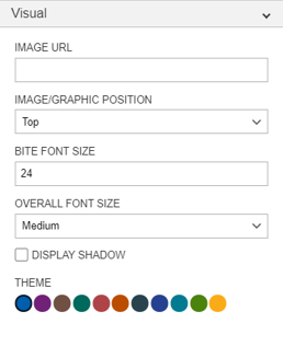
Once your data bite configuration is complete, you can change design elements such as font size and color palette in the “Visual” Tab.
- Image URL – If the data bite style in the general tab is set anything other than “Graphic”, an image can be added via a URL to the data bite. A URL from within the WCMS can be used, such as “https://wcms-wp.cdc.gov/wcms/4.0/cdc-wp/images-all-purpose/kitchen_adventurer_donut_1.jpg”
- Image/Graphic Position – This drop down allows you choose where the graphic or image is displayed.
- Bite Font Size – This selection specifically targets the size of the calculated result.
- Overall Font Size – The selection made in this dropdown determines the message font size.
- Theme – This section changes both the title bar and the highlighted data or graphic. If multiple Data Bites are used on a single page or in proximity to each other, it is recommended to use a single color to maintain uniformity.
Images
The Images tab only appears when you select the Data Bite Style of “value above message” or “value before message” in the general tab. When either of these options is selected, imagery can be assigned in a Static or Dynamic display type in the Images tab. The display type defaults to “None” which means no image is used. The static option lets you set one value for the image and where it displays.
The dynamic option lets you configure the data bite to display conditional imagery depending on the value that is calculated. The image will change based on inputs and filtering. Conditional imagery helps if data sets are updated frequently or dashboard values change with filtering. Having a dynamic conditional image in data bites helps users translate the information. Conditional image URLs can be configured for sets of three or four values:
- Four values – Default, less than, equal to, and greater than.
- Three values – Default, Less than or equal to, and greater than or equal to.
The default image shows if none of the calculations apply. You then set the values that will dynamically generate your additional images by clicking the “Add dynamic Image” button. These are executed to determine which image is shown. If there are multiple conditions, the order of them is important. Make sure that all calculations are accounted for. If images are not behaving as you expected, check to see if the default is showing up more than you planned. That would indicate that your conditions may be wrong or have gaps. For example, if you have conditional values for <50 and >50, a value of 50 could fall back to the default.

Finalization
Once configuration is complete, click the “OK” button in the bottom right of the window to exit the editor. BE SURE TO SAVE YOUR PROGRESS before you leave the data visualization page.
The Data Bite can now be added to your page like any other Data Visualization Module. When the page is published, you’ll be prompted to publish the visualization modules as well.