Heart Disease and Stroke Map Widget

At a glance

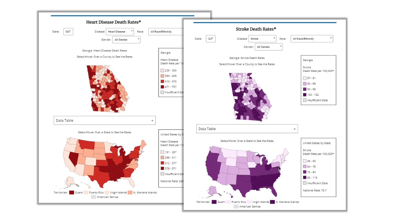
The Map Widget lets you display maps on your website using high-quality, local-level mortality data for heart disease and stroke that is automatically updated annually by CDC. Maps are displayed at the state level for the entire United States and at the county level for each state. The maps are interactive, enabling visitors to your site to view maps of heart disease and stroke death rates by racial or ethnic group and gender.
Screenshot of the heart disease and stroke widget

Embed this map widget on your website

See the maps to close the gaps
Use CDC's GIS tools to identify, document, and address geographic disparities in heart disease, stroke, and other chronic diseases.

It is easy to embed the map widget on your website using the code below (or share this code with your website administrator). Once added, technical maintenance is not required.

The code for the map widget enables you to select two default settings for the interactive maps:

  1. Heart disease or stroke mortality
  2. Choose the state

These default settings determine which maps visitors to your site will see initially, but they can change the maps using the interactive features.

Code sequence to set the default map for heart disease or stroke:

  • data-default-dataset="Heart Disease" (or choose "Stroke")

Code sequence to set the default state will be displayed:

  • data-default-state="Alabama" (choose the state)

If the name of the state has two words, use the following style: "North%20Carolina" (or choose the state that applies).

If you have any questions, contact GISXmoderator@cdc.gov.

View the widget

CDC's Atlas of Heart Disease and Stroke‎

Visit the Atlas of Heart Disease and Stroke to create your own local-level maps using high-quality data on heart disease and stroke, risk factors, social determinants of health, demographics, and proximity to care.