Key points
Data sources
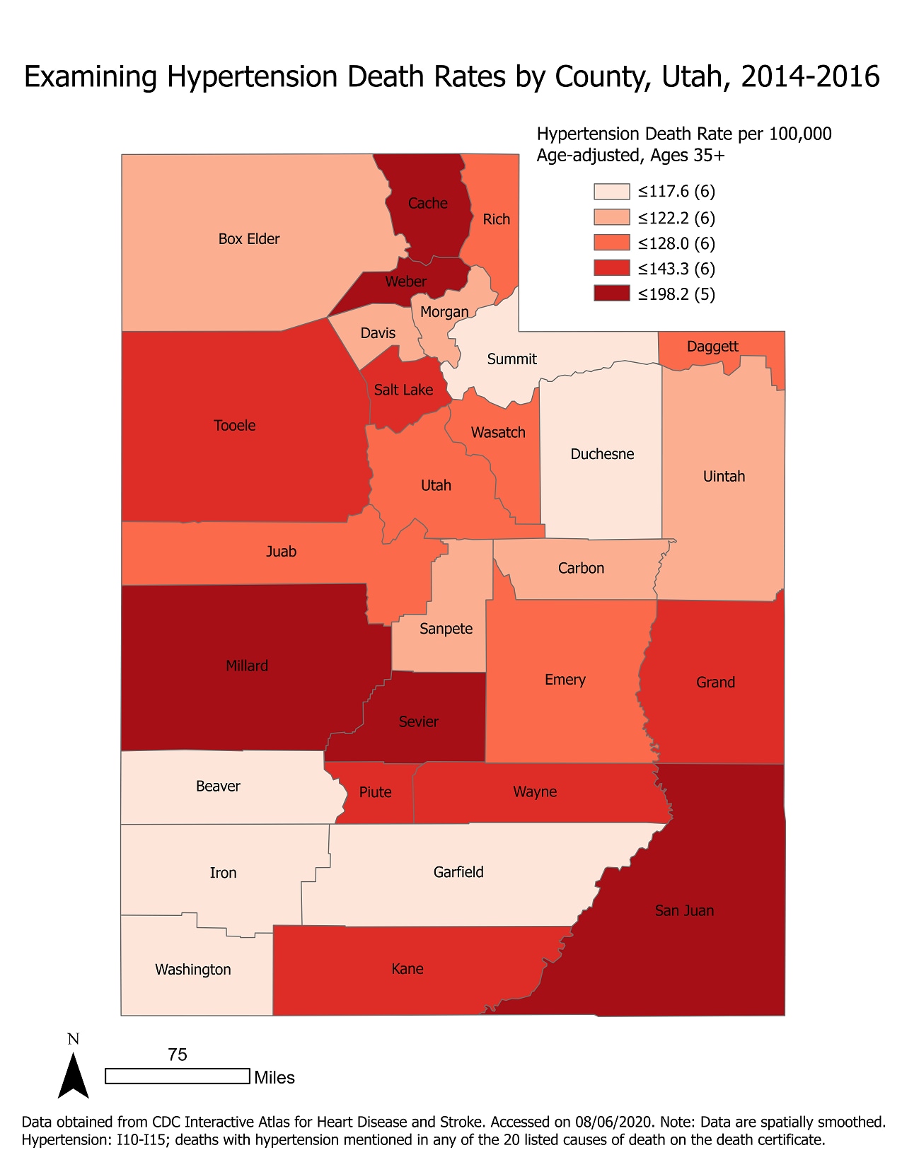
This map plots the hypertension death rates for Utah by county, for the years 2014-2016. Certain counties (Cache, Millard, Sevier, and San Juan) have higher rates of hypertension deaths, and these counties should be targeted by public health interventions. These counties are largely rural areas, which may mean residents have lower access to regular/convenient health screenings.
ArcGIS Pro 2.5.2
Data obtained from CDC Interactive Atlas for Heart Disease and Stroke Accessed on 08/06/2020. Note: Data are spatially smoothed. Hypertension: I10-I15; deaths with hypertension mentioned in any of the 20 listed causes of death on the death certificate.
This choropleth map displays county-level age-adjusted hypertension death rates for all Utah adults aged 35+ from 2014-2016. The map is sectioned by quintiles by county.
This map can be used and shared with public health workers to plan increased efforts in health screening and education for the areas showing highest burden. The map is also going to be expanded upon to examine the differences in hypertension deaths across sex and race/ethnicity. Once stratified across sex and race/ethnicity, better recommendations can be made on how to target specific groups who may need lifestyle change interventions or increased health screenings.
Wyatt Jensen, Utah Department of Health. Accessed from the Centers for Disease Control and Prevention’s Chronic Disease GIS Exchange https://www.cdc.gov/dhdsp/maps/gisx/mapgallery/UT-htn-death-rate.html Accessed from the Centers for Disease Control and Prevention's Chronic Disease Map Gallery.

