Key points
Map

Data sources
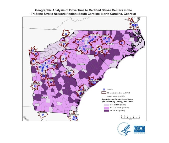
We found that approximately 55% of the population resided within a 30-minute drive time to a JCPSC, and 77% resided within a 60-minute drive time to a JCPSC (Table). We found that higher proportions of Hispanics (vs non-Hispanic blacks and non-Hispanic whites), people with more than a high school education (vs those with a high school education or less), people living in urban areas (vs those in rural areas), and people at or above the poverty level (vs those living in poverty) lived within either a 30- or 60-minute drive time to a JCPSC. Twenty-six percent of people living in rural areas lived within a 30-minute drive time to a JCPSC compared with 70% of those living in urban areas.
The map was created to assess patient access to Specialized Stroke care. We estimated demographic characteristics (race, ethnicity, urban-rural, poverty) residing within the drive time areas by extrapolating from the areal proportion of census tracks within each drive time and performed χ2 analyses.
ESRI Network Analyst 9.3 and SAS 9.1
StreetMap Pro 2007, US Census 2000, hospitals certified as JCPSCs as of September 27, 2010, Paul Coverdell PCNASR or Get With The Guidelines participants.
Using Network Analyst 9.3 and StreetMap Pro 2007, drive time distance was generated for 30 and 60 minute drive times from hospitals. Age-adjusted county-level stroke death rates were overlaid onto the drive-time areas.
Ishmael Williams, GIS Analyst, CDC
(770) 488-8060
ibw1@cdc.gov
Geographic Analysis of Drive Time to Certified Stroke Centers in the Tri-State Stroke Network Region (South Carolina, North Carolina, Georgia) Jenna A. Khan, MPH; University of Illinois at Chicago School of Public Health, Chicago, Illinois, [TODAY’S DATE]. Accessed from the Centers for Disease Control and Prevention's Chronic Disease Map Gallery.
