Key points
Map

Data sources
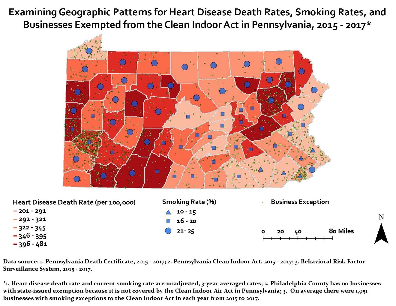
This map demonstrates the average heart disease mortality rates in counties of Pennsylvania from 2015 to 2017. The highest heart disease mortality rates (396 – 481 per 100,000) were located primarily in the southwest and northeast areas of the state, while the lowest heart disease death rates (201 – 291 per 100,000) were primarily located in the central, east, and southeast areas of the state. Geographically, areas with higher heart disease mortality rates also had higher current smoking rates. Similarly, areas with higher heart disease mortality rates also had more businesses that were exempted from Clean Indoor Act (i.e., customers were allowed to smoke at these business facilities) in Pennsylvania.
ArcGIS
Pennsylvania Death Certificate, 2015–2017; Pennsylvania Clean Indoor Act, 2015-2017; Behavioral Risk Factor Surveillance System, 2015-2017
Heart disease death data was obtained from the Pennsylvania Death Certificate System. ICD-10 was used to abstract data for death from heart diseases. The total number of heart disease deaths in each county in Pennsylvania was calculated for 2015, 2016, and 2017. The total population in each county was calculated for 2015, 2016, and 2017 as well. The average heart disease death rate was calculated by dividing the total number of deaths by the total population in each county from 2015 to 2017. The average current smoking rate was obtained from the Pennsylvania Department of Health website at https://www.health.pa.gov/topics/HealthStatistics/VitalStatistics/CountyHealthProfiles/Documents/current/index.aspx.
Data on businesses with smoking exception was obtained from the Pennsylvania Clean Indoor Air Act System for the years 2015, 2016, and 2017. Only businesses that were approved for smoking exception were included. The number of businesses with smoking exception in each county was calculated for 2015, 2016, and 2017. The total number of businesses with smoking exception and the average number of business in each county were calculated for 2015 – 2017. The above three sets of data were used to produce the map. Heart disease death rate is illustrated as graduated colors in counties, with darker color indicating higher death rate. Current smoking rate is displayed as triangles (low smoking rate), squares (intermediate smoking rate), and circles (high smoking rate). The businesses exempted from the Clean Indoor Act are shown as dots.
Jun Yang, Pennsylvania Department of Health
Jun Yang, Pennsylvania Department of Health. Accessed from the Centers for Disease Control and Prevention's Chronic Disease Map Gallery.
