Key points
Data sources
Major Findings
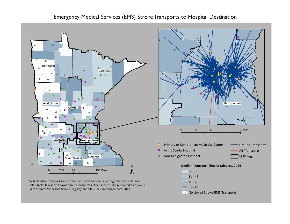
Minnesota counties with the highest transport times for stroke in 2014 did not have a designated stroke hospital.
How the map will be used, or has been used
Understanding transport times by EMS is important for targeting strategies to improve patient outcomes for stroke based on the prehospital phase of treatment and transport.
ArcGIS 10.5
Minnesota Stroke Registry and MNSTAR ambulance data, 2014.
Ambulance services in Minnesota submit data on their transport activity. These transports were linked with confirmed stroke cases in the Minnesota Stroke Registry using SAS 9.4. The stroke scene locations and the hospital were mapped as point locations in ArcGIS. A network analysis linked the stroke scene location to the hospital destination. EMS transport times were calculated in SAS 9.4 from the ambulance run report. Median transport times per county were calculated from all linked stroke–EMS records.
Julie Hoffer, Research Scientist, Minnesota Department of Health
651-201-4527
julie.hoffer@state.mn.us
Julie Hoffer, Minnesota Department of Health. Accessed from the Centers for Disease Control and Prevention's Chronic Disease Map Gallery.

