Key points
Data sources
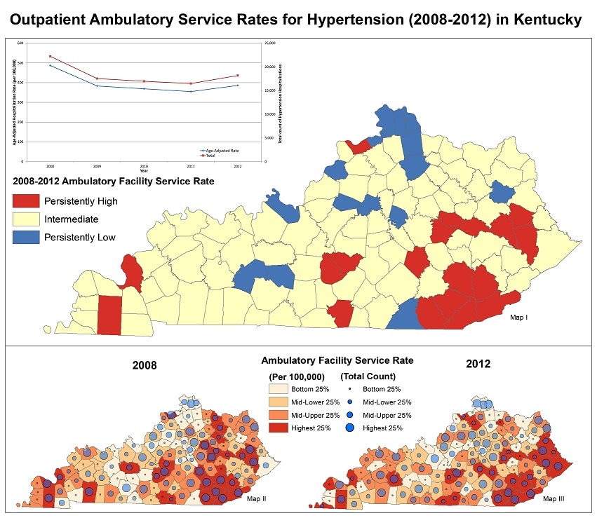
Map I demonstrates clusters of areas with a large burden in the overall ambulatory services utilization by those with diagnosed hypertension. Maps II and III are fairly similar in terms of counties that experience the relative highest rates and the largest counts.
ArcGIS 10.2.2
Office of Health Policy – Hospital Inpatient Discharge and Outpatient Services Database, 2008-2012.
Limitations of the data: The records comprising these data files are built form hospital-submitted or ambulatory facility submitted claims to payors. The inpatient files contain all inpatient discharges for a given calendar year. These are claims data and must be used with caution in epidemiological analysis. Individual records represent single admit-through-discharge events; multiple admissions of an individual patient cannot be definitively identified. Additionally, the number of facilities submitting data has increased over recent years. Data only include medical facilities in Kentucky, therefore patients seeking care in neighboring states are not included and estimated rates may appear lower than the true rates.
Due to the limitations of the data, it is important to focus on the general geographic trends and not on a specific county's rate.
Map I displays the overall changes for counties between 2008 and 2012. Persistently high counties were counties that had an Ambulatory Facility Service rate in the highest quartile in both 2008 and 2012, while persistently low counties were counties that had an Ambulatory Facility Service rate in the lowest quartile in both years.
Map II & III show the ambulatory service rate overlaid by total counts of ambulatory services utilization by county. Color bands and graduated circles are classified based on data quartiles.
Data were age-adjusted to 2000 US standard population using respective census intercensal estimates (2008) and vintage postcensal estimates (2012).
Sarojini Kanotra, Project Director/Epidemiologist III, Kentucky Department for Public Health
(502) 564-7996
Sarojini.Kanotra@ky.gov
Rock, P. and S. Kanotra. “Outpatient Ambulatory Service Rates for Hypertension in Kentucky” [map]. February 2016. Kentucky Department for Public Health. Accessed from the Centers for Disease Control and Prevention's Chronic Disease Map Gallery.

