Key points
Data sources
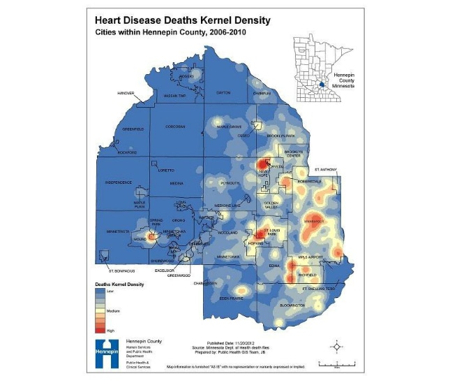
Kernel density mapping may enhance interpretation of the determinants of disease distribution in a given area. For example, in this map clustering of heart disease deaths is concordant with higher death rates depicted in a choropleth map (accompanying submission) in the cities of New Hope, Robbinsdale, St. Louis Park, and Spring Park. The clusters were almost entirely attributable to the presence of care facilities for the elderly in these municipalities. In contrast, kernel density “cold spots” like the City of Greenfield and Hassan Township in the far West of Hennepin County actually showed very high rates of heart disease deaths in the choropleth map because the few deaths occurring there did so against the backdrop of very low denominator populations. One could therefore argue – at least in this example – that the kernel density map was a better indicator of heart disease death activity than the more traditional choropleth map. The purpose of this map was to enhance interpretation of the determinants of heart disease death distribution in a given area.
Arc GIS 10
Minnesota Department of Health annual death files, 2006-2010; Hennepin County GIS boundary; 2010 US Census municipal boundaries.
The location of heart disease deaths was determined by geocoding address locations. The ArcGIS Kernel Density tool was used to calculate density of death addresses for Hennepin County. Output was a raster image with 150 meter cells displaying density using a neighborhood search radius of 1500 meters.
Jack Brondum, Epidemiologist, Hennepin County Human Services and Public Health Department (HSPHD)
(612) 543-5219
Jack.Brondum@co.hennepin.mn.us
Heart Disease Deaths Kernel Density: Cities within Hennepin County, 2006-2010 Jack Brondum, HSPHD; Jay Meehl, GIS Program Coordinator, HSPHD. Accessed from the Centers for Disease Control and Prevention's Chronic Disease Map Gallery.

