Key points
Data sources
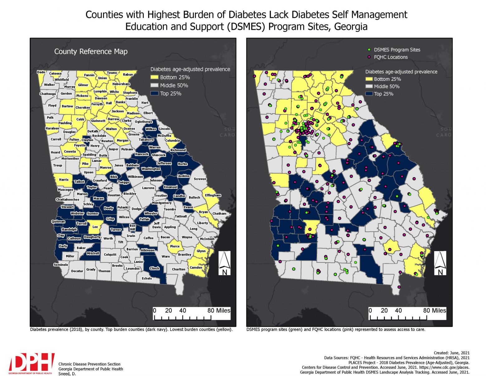
This map series allows readers to identify the geographic patterns of diabetes prevalence, DSMES locations, and FQHC locations throughout Georgia. A primary finding from this map is that counties in the Southern regions of Georgia have a higher burden of diagnosed diabetes, compared to the rest of the state. Additionally, this map emphasizes the different geographic patterns of DSMES locations and FQHC locations.
Though there has been major progress in implementing accredited DSMES programs within established FQHCs in Georgia, based on this map there are many counties in the highest category of diagnosed diabetes prevalence that still do not have an accessible DSMES program within or near them. This further encourages the need to focus efforts to increase the number of DSMES sites within or at least near these counties.
Overall, this map is quite impactful in displaying diabetes prevalence in Georgia and geographic access to diabetes-related care.
ArcGIS Pro
- CDC PLACES Project – 2018 Diabetes Age-Adjusted Prevalence (%)
- Georgia DPH DSMES Landscape Analysis Tracking Document (2018 – Present)
- National Federally Qualified Health Center (FQHC) location shapefile – (Health Resources and Services Administration (HRSA), 2021)
Diabetes age-adjusted prevalence (%) is displayed using a 3-category legend with quartile methodology and graduated colors. The middle two quartiles were combined to highlight the lowest and highest 25% diabetes prevalence. The color scheme selected is based on Color Brewer recommendations for 3-class legends with respect to readers who may be color blind. This map uses projection NAD 1983 Georgia Statewide Mapping System coordinates. Diabetes Self-Management Education and Support (DSMES) program sites were geocoded and mapped as points using the 2018 Census Geocoder tool. To display Federally Qualified Health Centers (FQHCs) within Georgia, a definition query was applied.
It is a program goal to have most, if not all FQHCs in Georgia house an accredited DSMES program site. This map will be used as a guide to enhance internal and external partnerships, document county and state burden, and streamline program efforts to reduce diabetes prevalence in Georgia. This map not only displays Georgia's most burdened counties, but it also gives an idea of where current diabetes-related resources are in relation to those counties. It is intended for these maps to be used to inform policymakers and researchers about the disproportionate geographic burden of diagnosed diabetes in Georgia.
Devon Sneed, Epidemiologist
Georgia State Department of Health
Devon.Sneed@dph.ga.gov
Devon Sneed, Georgia State Department of Health. Accessed from the Centers for Disease Control and Prevention's Chronic Disease Map Gallery.

