Key points

Best Practices
Like the data bite, waffle, and gauge, it is intended to provide at-a-glance information. Sparklines can be particularly helpful when used in groups to help readers compare trends across time.
You can use sparklines singly or in groups. Grouped visualizations invite readers to compare data points, so you should make certain that grouped sparklines are comparable in terms of public health messaging and presentation. While there may be exceptions to the rule, generally this means that all sparklines in the group have comparable start and end points and the same number of data points.
When grouping sparklines, stack them vertically if possible. This arrangement helps the reader scan the information more easily.
Good titles and supporting text can be invaluable for providing context, but keep them as brief as possible.
Providing a data source makes your graphic more reputable. It also allows those who are interested to dig deeper.
Quick Build Notes
- Select a line chart as the Visualization Type.
- Upload your data.
- Change the dropdown for Chart Type to Sparkline in the General panel.
- Type in the title and other text fields in the General panel.
- Select one or more Data Series.
- Set the Date/Category Axis.
Configuration Options
The example visualizations below highlight options available for sparklines. Key configuration selections are in the build notes section under each example.
For in-depth configuration information visit the Configuration Options section.
Sparkline Dashboard
These sparklines are presented in a dashboard. The vertical layout helps readers compare the data trends. It's easy to see, for example, that the trend for 2018 is the most consistently upward. (Remember to test your data visualizations in both small and large viewports.)
Note that all three sparklines begin and end at comparable points in time. And all three have the same number of data points (seven). The number of data points may not be obvious to the reader, but it's key to ensuring comparability of the trends.
All three sparklines were generated with the same data file. The "Limit by Start and/or End Dates" option in the Date/Category Axis panel limits each sparkline to a year of data points. The WCMS copy function was used to quickly generate each sparkline.
Sample Data: Sparkline Dashboard Data
Please note that these build notes are specific to the sparklines only and do not give instructions to replicate this in a dashboard. The dashboard was built with markup includes and sparklines side by side.
- Vertical
- Multiple Series: No
- Chart Type: Sparkline
- Show Title
- Data Scaling Type: Date (Linear Scale)
- Data Key: Time Period
- Date Parse Format: %m/%d/%Y
- Axis Date Display Format: %m/%d/%Y
- Limit by Start and/or End Dates
- Start Date: 01/01/2016 (or appropriate year)
- End Date: 12/31/2016 (or appropriate year)
Sparkline Variations
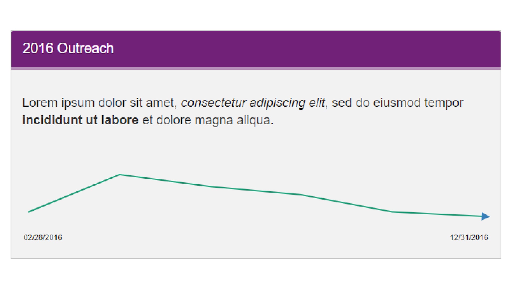
However you implement sparklines — as elements of a dashboard or as independent modules — the Visual panel in the chart designer offers a variety of styling options, as illustrated by the examples below.
Sample Data: 2016-2018 Outreach Data
See Build Notes 1
See Build Notes 2
See Build Notes 3
- Vertical
- Multiple Series: No
- Chart Type: Sparkline
- Title: 2016 Outreach
- Message: Lorem ipsum dolor sit amet, consectetur adipiscing elit, sed do eiusmod tempor incididunt ut labore et dolore magna aliqua.
- Data Scaling Type: Date (Linear Scale)
- Data Key: Time Period
- Date Parse Format: %m/%d/%Y
- Axis Date Display Format: %m/%d/%Y
- Limit by Start and/or End Dates
- Start Date: 01/01/2016
- End Dates: 01/01/2017
- Non-sequential palette #5
- Vertical
- Multiple Series: No
- Chart Type: Sparkline
- Title: 2016 Outreach
- Uncheck Show Title
- Message: 2016 Outreach
- Data Scaling Type: Date (Linear Scale)
- Data Key: Time Period
- Date Parse Format: %m/%d/%Y
- Axis Date Display Format: %m/%d/%Y
- Limit by Start and/or End Dates
- Start Date: 01/01/2016
- End Dates: 01/01/2017
- Non-sequential palette #5
- Use Accent Style
- Hide Background Color
- Vertical
- Multiple Series: No
- Chart Type: Sparkline
- Title: 2016 Outreach
- Message: Lorem ipsum dolor sit amet, consectetur adipiscing elit, sed do eiusmod tempor incididunt ut labore et dolore magna aliqua.
- Data Scaling Type: Date (Linear Scale)
- Data Key: Time Period
- Date Parse Format: %m/%d/%Y
- Axis Date Display Format: %m/%d/%Y
- Limit by Start and/or End Dates
- Start Date: 01/01/2016
- End Dates: 01/01/2017
- Use Selected Palette in Reverse Order
- Sequential palette #1
- Show Border
- Use Theme Background Color
