Key points

Best Practices
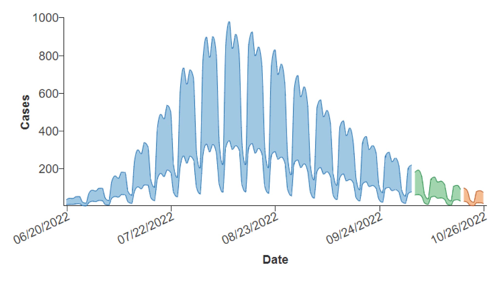
It is typically used to show estimated and/or forecast data. In the example below, there are three stages along the trendline based on the type of CI data: Estimate, Estimate Based on Partial Data, and Forecast.

If your forecast chart needs to show one or more data series as lines or bars (for example, to represent confirmed values), use the combo chart. Like the forecast chart, it shows confidence intervals across trendline stages but also allows mixing of visualization types.
The examples at the bottom of the page include a basic forecast chart with a single CI series and one with multiple CI series.
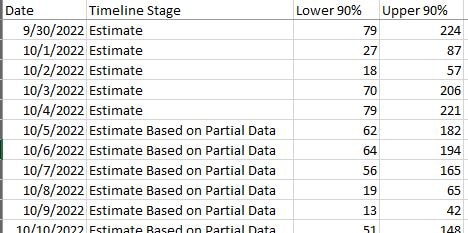
For each date represented in a forecast chart, your source data must include a timeline stage and lower CI and upper CI bounds (one pair for each CI series). The Excel file pictured below shows the minimum data required for a forecast chart with a single CI series.

- Timeline stages and CI values are not automatically included in the chart tooltips that display when a user interacts with the forecast chart. However, there are options for including both data elements in the chart editor. (The example charts do include these data in tooltips.)
- Ensure that you have provided adequate supporting text in the chart title, description, legend, etc. to help your users interact with and comprehend the chart easily.
- Consider which data columns needs to be included in the supporting table. CI columns are not automatically included, but they can be added (Columns panel).
Quick Build Notes
- Select a forecast chart as the Visualization Type.
- Upload your data.
- Type in the title and other text fields in the General panel.
- Select one or more Data Series.
- Set the Date/Category Axis.
Configuration Options
The example visualizations below highlight options available for forecast charts. Key configuration selections are in the build notes section under each example.
For in-depth configuration information visit the Configuration Options section.
Forecast Chart with Single CI Series
Users can hover over the visualization to see data details, including the CI values. (On mobile screens, users can click in the visualization area.)
Sample Data: Example Forecast Data
- Vertical
- Multiple Series: No
- Show in Tooltip
- Low Confidence Interval: Lower 90%
- High Confidence Interval: Upper 90%
- Axis Type: Numeric (Linear Scale)
- Label: Cases
- Data Scaling Type: Date (Linear Scale)
- Data Key: Date
- Label: Date
- Date Parse Format: %m/%d/%Y
- Axis Date Display Format: %m/%d/%Y
- Number of Ticks: 4
- Column: Lower 90%
- Label: Lower 90%
- Show in Data Table
- Column: Upper 90%
- Label: Upper 90%
- Show in Data Table
- Position: Right
- Legend Style: Circles
- Title: Timeline Stage
Forecast Chart with Multiple CI Series
The chart below is the same as the example above except that, in addition to a 90% CI series, it has a 50% CI series. Note that sequential shading is used to differentiate the CI series. The sample data has columns that are not included in the chart or supporting data table. Any additional columns such as these can be included in the data table via the Columns panel in the COVE editor.
Data Sample: Example Forecast Data
- Vertical
- Multiple Series: No
- Show in Tooltip
- Low Confidence Interval: Lower 90%
- High Confidence Interval: Upper 90%
- Show in Tooltip
- Low Confidence Interval: Lower 50%
- High Confidence Interval: Upper 50%
- Data Scaling Type: Date (Linear Scale)
- Data Key: Date
- Date Parse Format: %m/%d/%Y
- Axis Date Display Format: %m/%d/%Y
- Number of Ticks: 6
- Column: Lower 90%
- Label: Lower 90%
- Show in Data Table
- Column: Upper 90%
- Label: Upper 90%
- Show in Data Table
- Column: Lower 50%
- Label: Lower 50%
- Show in Data Table
- Column: Upper 50%
- Label: Upper 50%
- Show in Data Table
- Position: Right
- Legend Style: Circles
