Key points

Overview
As with a bar or line chart, this chart type is typically used to show significant data changes by category or date, but with the added advantage of highlighting baseline values, target values, etc.
A combo chart can also have two value axes, one on the left (the conventional position) and a second axis on the right. This feature allows you to include data series with different scales in order to show in general how they track with each other.
Best Practices
Much of the guidance related to bar and line charts also applies to combo charts. The greatest risk with combo charts is burdening your chart users with too much visual information. Don't try to do too much in a single chart.
Think carefully about how to present the various data series. Chart users should not need to repeatedly look at the legend for a reminder of what a particular bar, line, or area style represents.
You can suppress data in a bar chart for a number of reasons, including privacy concerns or preliminary data. Use the "Special Bar" section in the Data Series panel to select the value you want to display as suppressed with which symbol.
Note: For the best result with suppressed values, you will want to replace those values in your data with text like "SUP" or "ABC", rather than just relying on suppressing by numeric value in the visualization. This helps keep data private, as users can download the raw data.
Quick Build Notes
- Select Bar as the Visualization Type.
- Upload your data.
- Select Combo as the Chart Type in the General tab.
- In the Data Series panel, use the Add Data Series dropdown to select the columns from your data that represents the values to display.
- For each Data Series, select a Series Type to change how it will display. Ex. Line or Bar.
- In the Date/Category Axis panel, use the Data Key dropdown to select a column from your data that represents the date or category information for the chart.
- Select the Data Scaling Type appropriate to your Data.
Configuration options
The example visualizations below highlight options available for Combo Charts. Key configuration selections are in the build notes section under each example.
For in-depth configuration information visit the Configuration Page.
Example Combo Bar and Area Chart
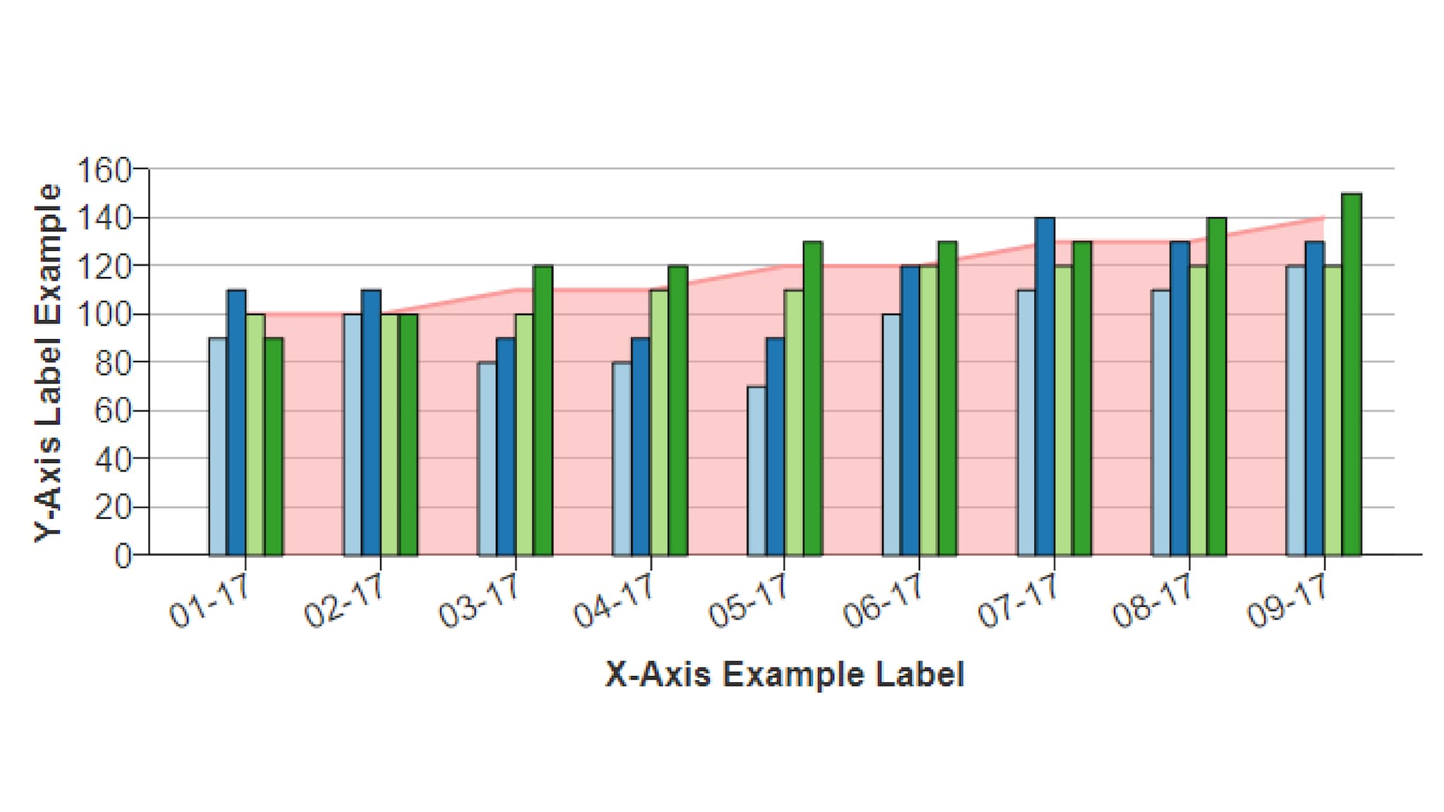
For each data series, you can select the display style: Bar, Solid Line, Small Dashed, Medium Dash, Large Dashed, or Area. This example shows bars for four data series with area shading for the fifth.
Sample Data: Combo Bar and Area Chart
Data Format
- Vertical
- Multiple Series: No
General
- Chart Subtype: Combo
- Chart Subtype: Regular
- Show Title: Checked
Data Series
Add Data Series:
- Data 1, 2, 3 and 4 - Series Type: Bar
- Monthly-Goal - Series Type: Area Chart, Series Line Type: CurveLinear
Left Value Axis
- Axis Type: Numeric (Linear Scale)
- Number of Ticks: 6
- Show Gridlines: Checked
- Left Axis Max Value: "160"
Date/Category Axis
- Data Scaling Type: Date (Linear Scale)
- Manual Ticks: Unchecked
- Data Key: Date
- Date Parse Format: %m/%d/%Y
- Axis Date Display Format: %m/%Y
- Number of Ticks: Auto
Example Bar Line Combo
For each data series, you can select the display style: Bar, Solid Line, Small Dashed, Medium Dash, Large Dashed, or Area. This example shows bars for four data series with area shading for the fifth.
Sample Data: Combo Bar and Area Chart
- Vertical
- Multiple Series: No
General
- Chart Subtype: Combo
- Chart Subtype: Regular
- Show Title: Unchecked
Data Series
- Cases - Series Type: Bar
- 7-Day Average - Series Type: Small Dashed
- Axis Type: Numeric (Linear Scale)
- Show Gridlines: Checked
- Left Axis Max Value: "600"
Date/Category Axis
- Data Scaling Type: Date (Linear Scale)
- Manual Ticks: Checked
- Data Key: Epi_date_V2
- Date Parse Format: %m/%d/%Y
- Axis Date Display Format: %m/%d/%Y
- Step Count: 8
