Does the material contain at least one visual that conveys or supports the main message?
Main Message and Call to Action
Make sure the words and visuals in the material convey the same message and reinforce each other. People expect words and visuals that appear close to each other to be about the same information. When the words and visuals are unrelated, unclear, or contradictory, people can get confused or distracted. Remember, don’t overload visuals with too much information.
Government rules about information accessibility on the web mean that all visuals need to have labels and captions. Labels and captions will help audiences easily and quickly get the gist of a visual and reduce chances of misinterpretation.
Photographs, graphs, and infographics are visuals. When they are clearly designed and not overloaded with information, they can help people easily and quickly grasp information.
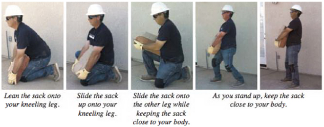
Example 1:

This is a series of five images in sequence showing the correct way to lift a heavy box. It is a good example of providing a visual that supports a main message about how to correctly lift heavy objects.
Example 2:
How can older adults prevent falls?
- Exercise regularly. Focus on increasing leg strength and improving balance.
- Try exercises that get more challenging over time. Tai Chi is a good choice.

This is an image of older adults doing balancing exercises. It is a good example of providing a visual that supports a main message about how to prevent older adults from falling.
Benefits of visuals: They
- provide an alternative to text to get the main message
- break up blocks of words
- make materials appear easier to read
Supported by the CDC Style Guide: A visual can convey ideas in a way words cannot.