About the U.S. Cancer Statistics Data Visualizations Tool

What to know

The U.S. Cancer Statistics Data Visualizations tool shows the official federal cancer statistics from central cancer registries that meet data quality criteria.
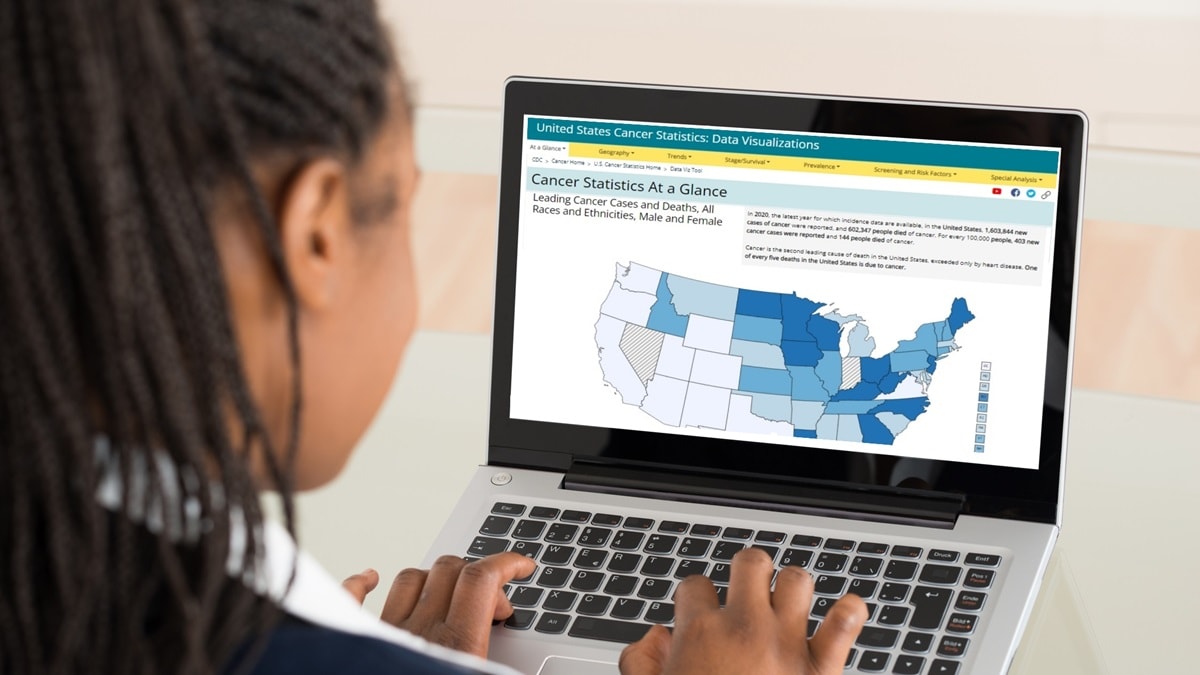
A woman looking at the Data Visualizations tool on her laptop

Overview

The U.S. Cancer Statistics Data Visualizations tool displays the official federal statistics on cancer from each central cancer registry meeting data quality criteria. The Centers for Disease Control and Prevention's (CDC's) National Program of Cancer Registries (NPCR) and the National Cancer Institute's (NCI's) Surveillance, Epidemiology, and End Results (SEER) Program combine their cancer incidence data sources to produce these statistics. Mortality data are from CDC's National Center for Health Statistics (NCHS) National Vital Statistics System (NVSS).

What data does the U.S. Cancer Statistics Data Visualizations tool contain?

The U.S. Cancer Statistics Data Visualizations tool displays the official federal cancer statistics. This tool provides incidence and death counts, rates, stage distribution, and trend data; survival and prevalence estimates; and state-, county-, and congressional district-level data in a user-driven format. It includes incidence data on more than 1.7 million cases of invasive cancer diagnosed each year. The population coverage may vary due to suppression (for example, if 16 or fewer cases were reported or if the state requested suppression), or if a state did not meet U.S. Cancer Statistics publication criteria. For the most recent release, data from 98% of the U.S. population are displayed for cancer cases diagnosed in 2021 alone and the most recent 5 years combined (2017 to 2021). Cancer incidence data are not available from Indiana for 2020 and 2021.

The tool also includes malignant cancer mortality data from all 50 states, the District of Columbia, and Puerto Rico as recorded in the NVSS. Mortality data are available for 100% of the U.S. population for cancer deaths reported in 2022 alone and 5 years combined (2018 to 2022).

Incidence and mortality data are available for the nation, state, congressional district, and county. Cancer incidence and mortality trend data are presented from 1999 through 2021 and 1999 through 2022, respectively. The most recent year for which incidence data are available is 2021 and cancer mortality data are available for 2022.

The tool also presents national and state survival and prevalence estimates, which are based on NPCR data covering 92% of the U.S. population. The tool also includes information about the prevalence of risk factors related to cancer, use of cancer screening tests, and status of human papillomavirus (HPV) immunization.

How can the data be used?

These data can be used to monitor cancer trends over time, determine cancer patterns in various populations, guide planning and evaluation of cancer control programs, help set priorities for allocating health resources, and provide information for a national database of cancer incidence.

What was the effect of COVID-19 on cancer incidence data?

In March 2020, the World Health Organization declared COVID-19 a pandemic. Soon after, stay-at-home orders, business and school shutdowns, and travel advisories were implemented in the United States to prevent the spread of COVID-19. Additionally, some health care systems reduced access to routine care. These measures, along with concerns about getting COVID-19, interrupted cancer screening, diagnosis, and care as people postponed or deferred health care visits, particularly from March to May 2020.

The 2023 data submission includes new cancer cases diagnosed in 2020 and 2021, the first and second year of the COVID-19 pandemic. The missed cancer diagnoses resulting from disruptions in health services caused by the pandemic may have contributed to an observed decline in incidence for most cancer sites in 2020. The numbers of new cases diagnosed in 2021 are still a little lower than expected for some cancer types but have returned to pre-pandemic counts for other cancer types. Caution must be taken when examining trends to avoid incorrect interpretations of the effect of cancer prevention and early detection efforts. Observed downward trends may be due largely to the lower observed incidence in 2020. CDC and NCI include the 2020 incidence rates in statistical reports and graphics, but do not include them in joinpoint models. The 2021 incidence data will be included in statistical reports and joinpoint models (not included in Data Visualizations tool).1 JoinPoint software allows researchers to exclude incidence data for 2020, 2021, or both years from trend analyses. Exclude 2020 data for incidence trend analyses, but 2021 data can be included in reports and trend analyses.

What cautions should be used in interpreting rates by race and ethnicity?

Use caution if comparing bridged race and ethnicity incidence data to single race and ethnicity mortality data as single race and bridged race data are not considered to be directly comparable.2

Use caution when interpreting differences in rates among racial and ethnic (Hispanic origin) populations. A study using SEER data suggests that the quality of race data in cancer registries is considered excellent for White, Black, Asian and Pacific Islander people, and substantial for Hispanic people, while data for American Indian and Alaska Native people has been shown to be considerably underreported. A study involving cancer mortality data shows that death rates for White and Black people are generally reliable, whereas death rates for Asian and Pacific Islander, American Indian and Alaska Native, and Hispanic people are underestimated.

Therefore, incidence and mortality data in the Data Visualizations tool may be underestimated for Asian and Pacific Islander, American Indian and Alaska Native, and Hispanic people, possibly due to racial and Hispanic origin misclassification. NCHS is working with states to improve the reporting of race and ethnicity on death certificates.

To better represent U.S. populations and to improve racial misclassification, data in the U.S. Cancer Statistics Data Visualizations tool are restricted to non-Hispanic people for White, Black, Asian and Pacific Islander, and American Indian and Alaska Native people.

To further improve the accuracy of cancer burden estimates among the American Indian and Alaska Native population, the following methods are applied to U.S. Cancer Statistics incidence data in the Data Visualizations tool:

  • The data presented in the tool are linked with Indian Health Service (IHS) administrative records to improve the race classification.
  • The data are restricted to non-Hispanic populations.
  • The data presented in the tool's American Indian and Alaska Native restricted to PRCDA only module are restricted to IHS Purchased/Referred Care Delivery Areas (PRCDA).

Grouping racial or Hispanic origin subpopulations into one racial or Hispanic origin population can mask differences in subpopulations. Asian, Pacific Islander, American Indian, Alaska Native, and Hispanic people are not homogeneous groups. The subpopulations are grouped into single populations because of small numbers or concerns regarding the possible misclassification of race and Hispanic origin among the subpopulations. Cancer rates by more detailed categories of race have been published.3 4 5

Additional information is available in the Data Visualizations tool's Technical Notes, Interpreting Race and Ethnicity in Cancer Data.

What cautions can be used in interpreting rates by congressional districts?

The cancer incidence and death counts and rates presented in the Congressional District Estimates page are estimated using county-level data because direct measures on congressional district-level data are not available. Please be mindful that these are estimated counts and rates, and they are not meant to be compared across congressional districts.

Since the congressional district estimates were calculated using county-level data, if any county-level data are missing, then the overall state counts presented in the Congressional District Estimates page will not match the counts in the U.S. Cancer Statistics Data Visualizations tool's At a Glance and State/County/Territory pages. Instead, the counts in the Congressional District Estimates page will match the state counts calculated by aggregating across the county-level case counts.

Whom can I contact for questions about the U.S. Cancer Statistics Data Visualizations tool?

Please email U.S. Cancer Statistics staff at uscsdata@cdc.gov.

Suggested citation

U.S. Cancer Statistics Data Visualizations Tool. U.S. Department of Health and Human Services, Centers for Disease Control and Prevention and National Cancer Institute; www.cdc.gov/cancer/dataviz, released in June 2024.

U.S. Cancer Statistics Data Visualizations tool overview video

This video explains how to use the U.S. Cancer Statistics Data Visualizations tool.

References

1Thompson CA, Gomez SL, Hastings KG, et al. The burden of cancer in Asian Americans: a report of national mortality trends by Asian ethnicity. Cancer Epidemiol Biomarkers Prev. 2016;25(10):1371–1382.

2Heron, MP. Comparability of race-specific mortality data based on 1977 versus 1997 reporting standards. Natl Vital Stat Rep. 2021;70(3):1–31.

3Liu L, Noone AM, Gomez SL, et al. Cancer incidence trends among native Hawaiians and other Pacific Islanders in the U.S., 1990–2008. J Natl Cancer Inst. 2013;105(15):1086–1095.

4Gomez SL, Noone AM, Lichtensztajn DY, et al. Cancer incidence trends among Asian American populations in the United States, 1990–2008.J Natl Cancer Inst. 2013;105:1096–1110.

5Centers for Disease Control and Prevention. Highlights from 2021 Cancer Incidence with Comparisons to Previous Years. Centers for Disease Control and Prevention, U.S. Department of Health and Human Services; 2024.