Color Contrast Analyzer

This week’s tip was written by Michelle Natale, NCEH/ATSDR’s 508 expert.
Checking color contrast is an important part of 508 compliance. High-contrast color combinations are easier to read. Low color contrast can cause people to miss important information or strain their eyes to read your content, especially in high-glare or bright environments. One of the easiest ways to check is with the Color Contrast Analyzer.

-
Go to the Color Contrast Analyzer site and download it. Open the tool and your document and have them both visible at the same time.
-
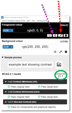
To test your foreground or text color, click on the eyedropper (dotted red arrow). Then drag it to your document, hover it over the color you want to test, and click again. Then click on the background color eyedropper and do the same with the background color.
-
As you can see, black text on a white background passes the color contrast test. It has a 21:1 contrast ratio.
To be 508-compliant, the ratio must be at least 4.5:1.
-
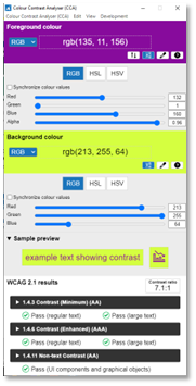
If your colors don’t pass the test, you can use the sliding bar (dotted purple arrow). You can slide the bar to change the colors and watch the contrast ratio change (see below). When you find colors that pass the test, you can put those colors into your document.


Disclaimer: This article is not an official endorsement of the Color Contrast Analyzer by CDC.