Key points

Best Practices
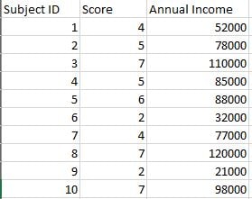
Each dot in a scatter plot requires two paired variables. The following image from Excel shows 10 paired variables for Score and Annual Income. (These are a subset of the data used to generate the first example above.) Additional columns, such as Subject ID in this example, can remain in the data source file but are not used to generate the chart.
These data are for a single-series plot. You can use COVE to plot multiple series.

When it comes to the minimum number of data pairings, the guidance varies, with most guides recommending a number in the 30-to-50 range. Generally, the more, the better.
Include a thorough description of what is being measured and label the variables clearly.
If your plot shows outliers, consider whether the outliers require explanation or commentary.
With many scatter plots, one variable can be characterized as independent and the other as dependent. The independent variable stands alone and isn't changed by the other variable. In the examples on this page, Annual Household Income is an independent variable. The independent variable should always go on the X axis.
Sometimes it's not obvious which variable is independent and which is dependent. That's okay, but you may need to explain the dependent/independent nature of each.
Be careful with the wording in your plot description and other text. Remember that scatter plots do not prove causation. They can only imply a correlation between variables.
Quick Build Notes
- Select Scatter Plot as the Visualization Type.
- Upload your data.
- Type in the Title and other text fields in the General tab.
- Select the Data Series.
- Set the Date/Category Axis.
Configuration Options
The example visualizations below highlight options available for scatter plots. Key configuration selections are in the build notes section under each example.
For in-depth configuration information visit the Configuration Options section.
Positive vs Negative Trends
Scatter plots show not only the strength of a relationship but the trend direction as well. In this example, the correlation between Annual Household Income and Score is considered negative due to the downward direction of the trend.
Data Sample: Negative Trend Data
- Axis Type: Numeric (Linear Scale)
- Label: Score
- Data Scaling Type: Continuous
- Data Key: Annual Income
- Label: Annual Household Income
- Prefix: $
- Number of Ticks: 5
- Add Commas
Multiple Data Series
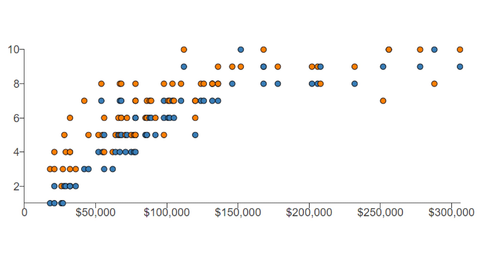
The WCMS can color-code multiple data series in scatter plots. This example shows Year 1 vs. Year 2 scores as they relate to Annual Household Income. Note that a legend is required only when multiple series are plotted.
Data Sample: Multiple Data Series
- Y1 Score
- Y2 Score
- Axis Type: Numeric (Linear Scale)
- Label: Score
- Data Scaling Type: Continuous
- Data Key: Annual Household Income
- Prefix: $
- Number of Ticks: 5
- Add Commas
Linear vs Nonlinear Relationships
The shape of the dot pattern may tell a story. In this example, the dots hug closely together, but the trend is non-linear.
Data Sample: Nonlinear Data
- Numeric (Linear Scale)
- Label: Score
- Data Scaling Type: Continuous
- Data Key: Annual Income
- Label: Annual Household Income
- Prefix: $
- Number of Ticks: 5
- Add Commas
