Key points

Best Practices
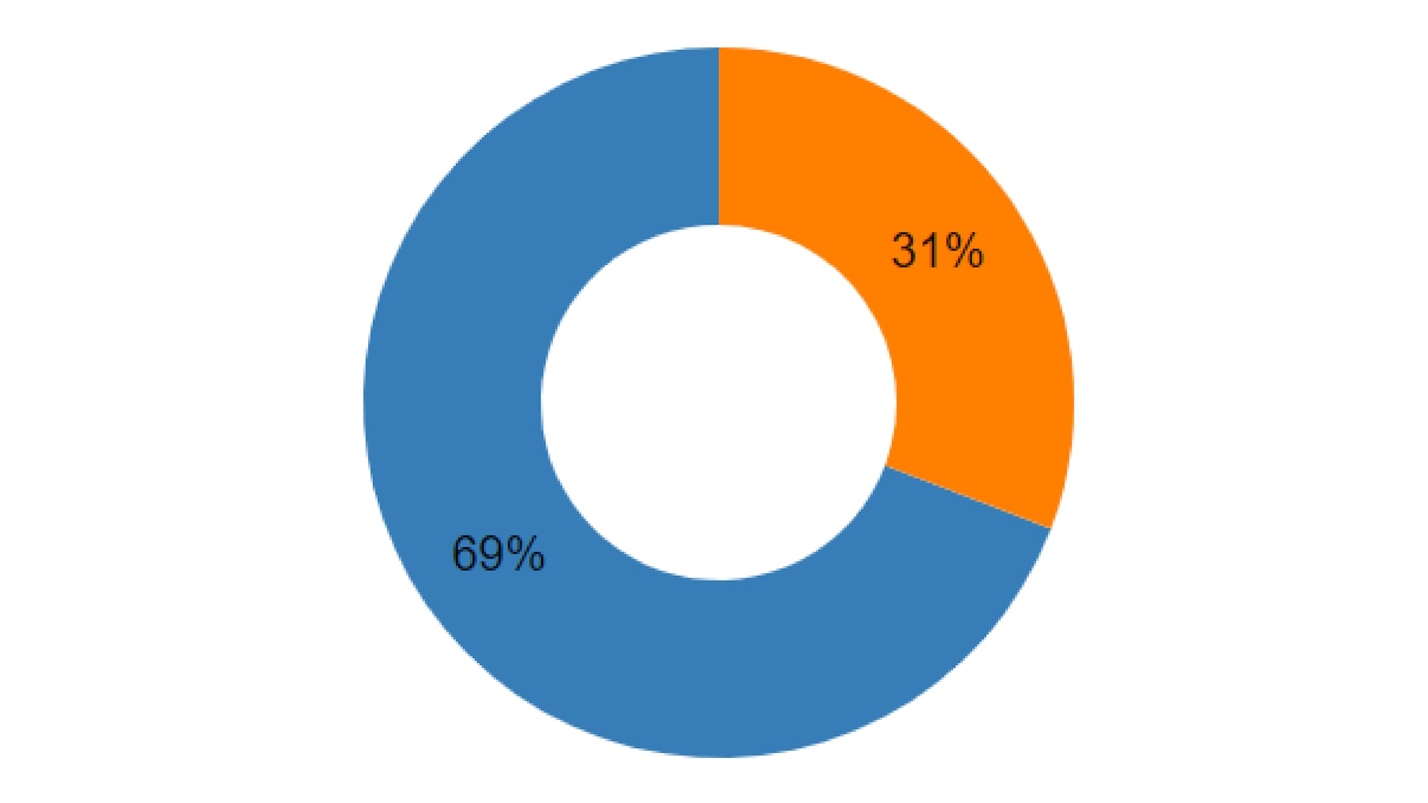
Pie and Donut charts are used to display a comparison between multiple data series. Pie charts are best when focused on 3-6 data series with clear differences between their numerical proportions. Pie charts are not recommended if the user is expected to compare or analyze precise information. A Donut chart is recommended for use when comparing very few slices where there is an large difference in the relationship between elements.
Use:
- To compare multiple data series
- To easily showcase largest & smallest series in a data set
- Donut - To showing a single portion of a whole value (1/2, 1/4, etc.)
- Donut - When 2-3 points of data are being compared
Don't Use:
- When displaying data series that are very similar to each other
- When showing data the user is expected to analyze precisely
- Donut - For displaying subtle differences in quantitative values.
Quick Build Notes
- Select "Pie" as the Visualization Type.
- Upload your data.
- Type in the title and other text fields in the General tab. Donut can be selected from the "Pie Chart Type".
- In the Data Format panel, select the Data Column from your data that represents the values to display.
- In the Segments panel, select the Segment Label Column from your data that represents the Labels to display for each value.
Configuration Options
The example visualizations below highlight options available for pie and donut charts. Key configuration selections are in the build notes section under each example.
For in-depth configuration information visit the Configuration Options section.
Example Pie Chart
Sample Data: Pie Chart
Data Format
- Vertical
- Multiple Series: No
General
- Pie Chart Type: Pie
- Show Title: Unchecked
Example Donut Chart
Sample Data: Donut Chart
Data Format
- Vertical
- Multiple Series: No
General
- Pie Chart Type: Donut
- Show Title: Unchecked
Data Column
Segment Label
