Key points

Best Practices
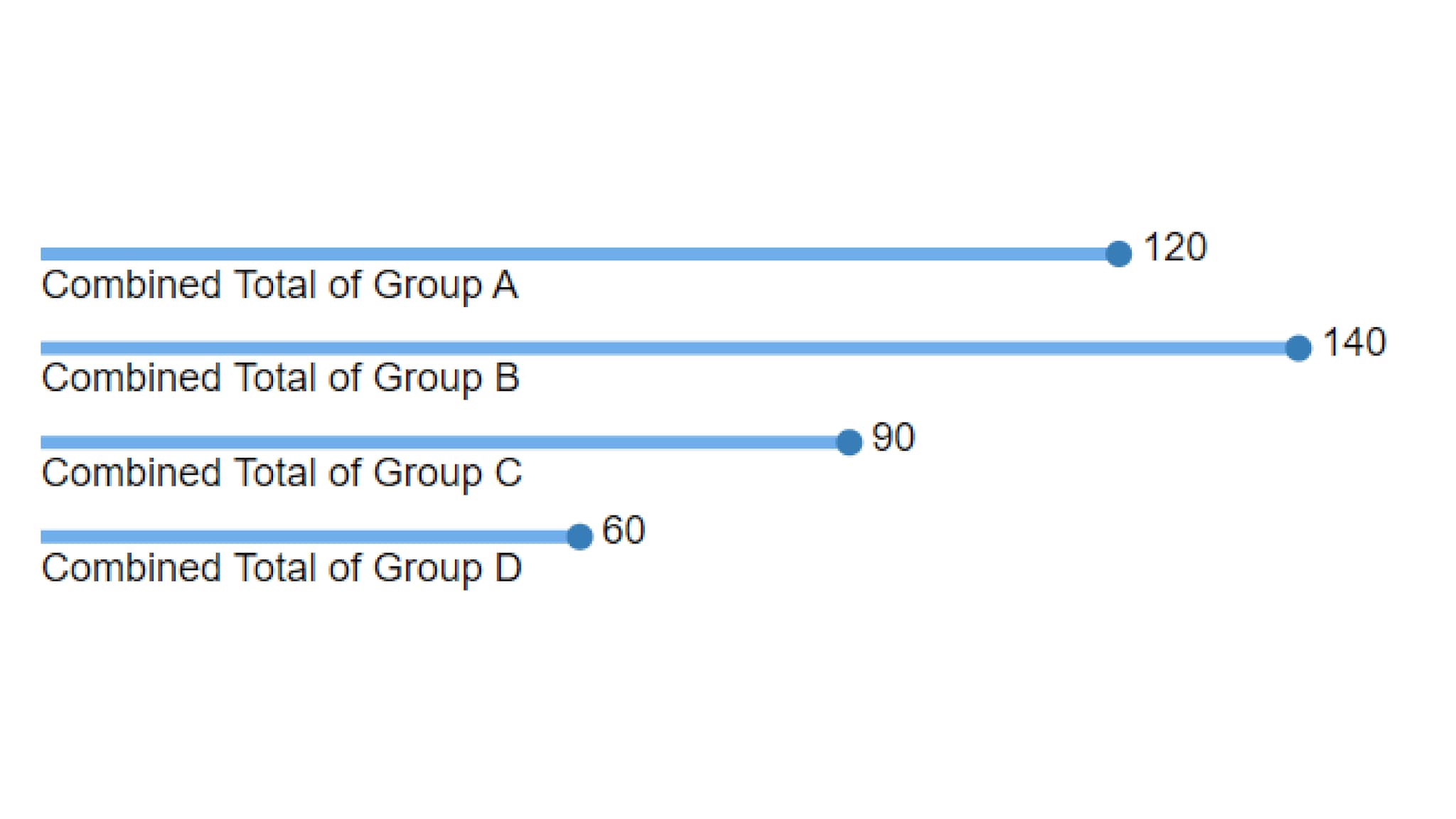
Lollipop charts are best used to achieve an uncluttered minimalist look. Removing the Axis and Ticks help that effect.
Quick Build Notes
- Select "Bar" as the Visualization Type.
- Upload your data.
- Select the Lollipop as the Bar Style in the General tab.
- In the Data Series panel, use the Add Data Series dropdown to select the columns from your data that represent the values to display.
- In the Date/Category Axis panel, use the Data Key dropdown to select a column from your data that represents the date or category information for the chart.
- Select the Data Scaling Type appropriate to your Data.
- Make styling choices in the Visual panel.
Configuration options
The example visualization below highlights some of the options available for Lollipop Bar charts. Key configuration selections are in the build notes section below the example.
For in-depth configuration information visit the Configuration Page.
Example Horizontal Lollipop Chart
Sample Data: Horizontal Bar Chart
- Vertical
- Multiple Series: No
- Chart Subtype: Regular
- Orientation: Horizontal
- Bar Style: Lollipop
- Label Placement: Below Bar
- Display Numbers After Bar: Checked
- Axis Type: Numeric (Linear Scale)
- Max Value: 160
- Data Scaling Type: Categorical (Linear Scale)
- Data Key: Group
