Key points

Best Practices
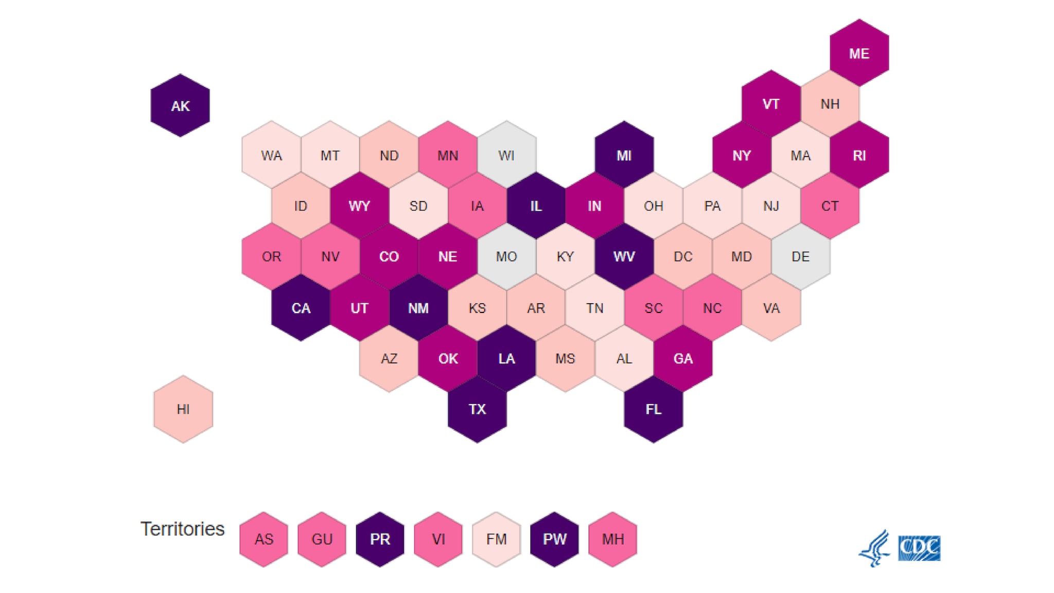
For U.S. data, the WCMS supports both choropleth and hex-tile maps (also called "hex-grid maps" or simply "hex maps").

Generally, use choropleth maps when geographic precision is key to the public health message — for example, to show a geographic trend or to highlight geographic variation. They are intuitive and work well for presenting at-a-glance information. (You should also use choropleth maps when city data are being mapped. Hex-tile maps do not support cities.)
When geography isn't important to the message or when there is concern about the "Alaska effect" (the possible misperception of data due to the great surface area of some low-population states), the hex-tile map offers benefits over the choropleth map:
- The hex-tile map allows viewers to see the colors and labels of the smallest states as easily as the largest states.
- If a map serves as a navigation aid to information such as state profiles, hex tiles may be preferred because they make interaction with small states easier.
- The hex-tile map is a good solution when the goal is to present simple yes / no data (for example, the states where a certain public health policy is in effect or the states that have reached a certain threshold).
Data maps typically show normalized data (such as percentages or per-capita numbers). Due to the vast population differences among geographic areas, non-normalized data may be misleading. But there is an exception: if the goal is to show where the largest numbers of people can be reached for public health interventions, non-normalized data may be more useful.
For states or countries with values such as "*" or "NA," you can specify these values as "special classes" (i.e., special data classes). The map tool automatically color-codes these special classes with shades of gray, one for each special class. For optimal usability, avoid having more than two special classes in a map.
Arrows can be used in your hex map to indicate trends or trajectories to help the page user interpret your data. These arrows are added in the visualization editor using a conditional set of elements that reference a column from your data set. Example: A Hex can display an "Arrow Right" for any value in the "Rate" column that is "> =" "9". These settings can be found in the Type panel after checking "Display shapes on Hex Map".
Quick Build Notes
- Select United States map as the Visualization Type.
- Upload your data.
- Set the Data Classification Type to Categorical.
- Type in the title and other text fields in the General panel.
- Select the Geography column.
- Select the Data Column.
- Select Latitude and Longitude columns if needed for cities.
Configuration Options
The example visualizations below highlight options available for hex maps. Key configuration selections are in the build notes section under each example.
Don't forget to check out the General Map page for additional map guidance.
For in-depth configuration information visit the Configuration Options section.
Example Standard Hex Map
Note that hex maps do not support city data other than Washington, DC.
Sample Data: Standard Hex Example
- Vertical
- Multiple Series: No
- Geography: United States
- Geography Subtype: US State-Level
- Display as Hex Map
- Geography: State
- Data Column: Rate
- Legend Type: Equal Number (Quantiles)
- Single Column Legend
Example Filterable Hex Map
Hex maps can also be filterable.
Sample Data: Example Filterable Hex
- Vertical
- Multiple Series: No
- Geography: United States
- Geography Subtype: US State-Level
- Display as Hex Map
- Geography: State
- Data Column: Rate
- Filter Behavior: Apply Button
- Label: Filter Label Displays Here, Filter Column: Item Required, Filter Style: Dropdown, Filter Order: Ascending Alphanumeric
Example Hex Map with Arrows
Use arrows to indicate trends or categories. Any column in your data can be used for this.
Sample Data: Standard Hex Example
- Vertical
- Multiple Series: No
- Geography: United States
- Geography Subtype: US State-Level
- Display as Hex Map
- Display Shapes on Hex Map
- Legend Shape Group 1 - Legend Title: Trends, Legend Descriptions: The arrows reflect the trends of reported numbers
- Shape Condition 1 - Shape Column: Arrow Down, Column Conditional: Rate <= 40
- Shape Condition 2 - Shape Column: Arrow Right, Column Conditional: Rate >= 80
- Geography: State
- Data Column: Rate
