Key points

Best Practices
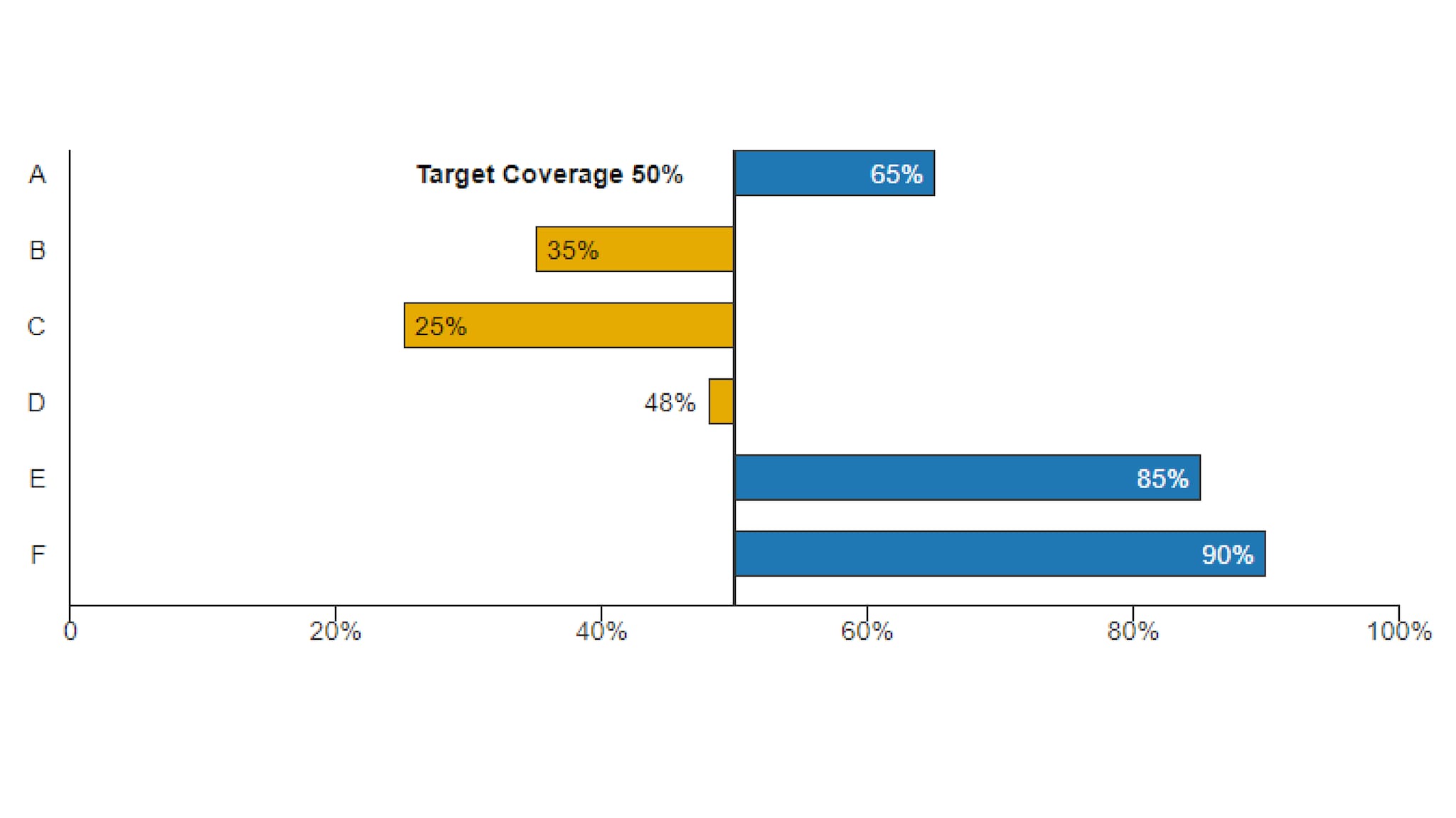
Much like other Bar Chart varieties, Deviation Bar Charts are used to easily compare data between groups at a glance. All values above the reference point are coded in one color, with values below the reference point in a contrasting color. They reveal data relationships against a reference point that might not be readily apparent from a table of values.
Use:
- When an above/below relationship to a reference point is important.
Quick Build Notes
- Select "Bar" as the Visualization Type.
- Upload your data.
- Select the Deviation Bar Subtype in the General tab.
- In the Data Series panel, use the Add Data Series dropdown to select the columns from your data that represent the values to display.
- Set the Deviation Point, Label, and Show Deviation Point Label in the Value Axis panel.
- In the Date/Category Axis panel, use the Data Key dropdown to select a column from your data that represents the date or category information for the chart.
- Select the Data Scaling Type appropriate to your Data.
Configuration options
The example visualization below highlights options available for Deviation Bar charts. Key configuration selections are in the build notes section under the example.
For in-depth configuration information visit the Configuration Page.
Example Deviation Bar Chart
The Deviation Point is manually set in the COVE editor.
Sample Data: Deviation Bar Chart Data
- Vertical
- Multiple Series: No
- Chart Subtype: Deviation
- Orientation: Horizontal
- Bar Style: Flat
- Display Numbers on Bar: Checked
- Show Title: Unchecked
- Axis Type: Numeric (Linear Scale)
- Suffix: "%"
- Max Value: "100"
- Deviation point: "50"
- Deviation Point Label: "Target Coverage"
- Show Deviation Point Label: Checked
- Data Scaling Type: Categorical (Linear Scale)
- Data Key: Department
