Key points

Best Practices
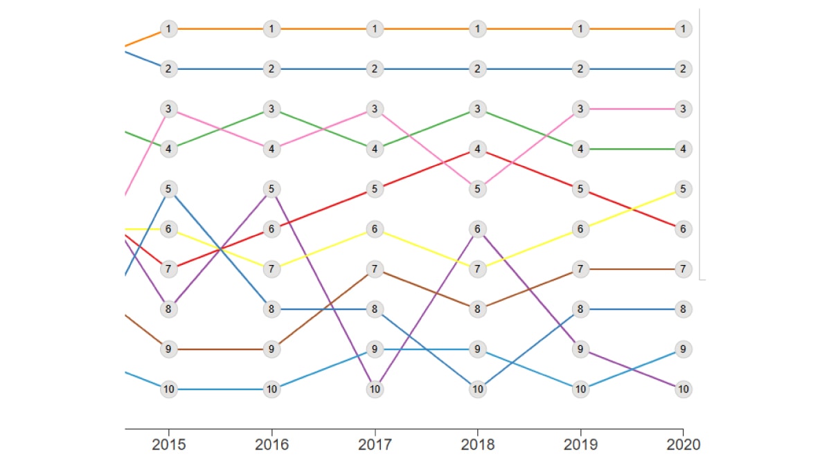
Bump Charts are useful for showing relative positions of different entities across multiple time periods. It also allows for easy comparison of position, performance, or rankings of multiple items in respect to each other, rather than focusing on values.
For best results, make sure you add padding in the Left Value Axis panel and remove it from the Date/Category Axis panel. This ensures the lines are continuous across and the numbers easy to read.
Quick Build Notes
- Select a bump chart as the Visualization Type (note that as of September 2024, there is not a bump chart tile, select a bar chart on this screen)
- Upload your data.
- Change the dropdown for Chart Type to Bump Chart in the General panel.
- Type in the title and other text fields in the General panel.
- Select your Data Series.
- Add padding to the value axis in the Left Value Axis panel.
- Set the Date/Category Axis and remove the padding.
Configuration Options
The example visualizations below highlight options available for bump charts. Key configuration selections are in the build notes section under each example.
For in-depth configuration information visit the Configuration Options section.
Example Bump Chart
The bump chart below currently has its data table hidden due to a bug. This is not best practice.
Sample Data: Bump Chart Data
Data Format
- Vertical
- Multiple Rows: Yes
- Row Describing: Short Topic
- Date/Category: Timestamp
- Numeric Value: Rank
General
Chart Height: 500
Data Series
- Sibling
- Neck
- Girlfriend
- Bullying
- Mother
- Overdose
- Depression
- Vehicle
- Friends
- Head
Left Value Axis
- Number of Ticks: 10
- Size (Width): 75
- Add Padding to Value Axis Scale
Date/Category Axis
- Padding (Percent): 0
- Data Key: Timestamp
- Label: Year
- Date Parse Format: %m/%d/%Y
- Axis Date Display Format: %Y
- Data Table Date Display Format: %Y
- Hover Date Display Format: %Y
