At a glance
Introduction
As a field epidemiologist, you will collect and assess data from field investigations, surveillance systems, vital statistics, or other sources. This task, called descriptive epidemiology, answers the following questions about disease, injury, or environmental hazard occurrence:
- What?
- How much?
- When?
- Where?
- Among whom?
The first question is answered with a description of the disease or health condition. "How much?" is expressed as counts or rates. The last three questions are assessed as patterns of these data in terms of time, place, and person. After the data are organized and displayed, descriptive epidemiology then involves interpreting these patterns, often through comparison with expected (e.g., historical counts, increased surveillance, or output from prevention and control programs) patterns or norms. Through this process of organization, inspection, and interpretation of data, descriptive epidemiology serves multiple purposes (see below).
Purposes of Descriptive Epidemiology
Descriptive epidemiology
- Provides a systematic approach for dissecting a health problem into its component parts.
- Ensures that you are fully versed in the basic dimensions of a health problem.
- Identifies populations at increased risk for the health problem under investigation.
- Provides timely information for decision-makers, the media, the public, and others about ongoing investigations.
- Supports decisions for initiating or modifying control and prevention measures.
- Measures the progress of control and prevention programs.
- Enables generation of testable hypotheses regarding the etiology, exposure mode, control measure effectiveness, and other aspects of the health problem.
- Helps validate the eventual incrimination of causes or risk factors.
Your analytic findings must explain the observed patterns by time, place, and person.
Organizing Epidemiologic Data
Organizing descriptive data into tables, graphs, diagrams, maps, or charts provides a rapid, objective, and coherent grasp of the data. Whether the tables or graphs help the investigator understand the data or explain the data in a report or to an audience, their organization should quickly reveal the principal patterns and the exceptions to those patterns. Tables, graphs, maps, and charts all have four elements in common: a title, data, footnotes, and text (see Components of Statistical Data). In this chapter, additional guidelines for preparing these data displays will appear where the specific data display type is first applied.
Characterizing The Cases (What?)
Tables are commonly used for characterizing disease cases or other health events and are ideal for displaying numeric values. In addition to the previously mentioned elements in common to all data displays (Components of Statistical Data Displays), tables have column and row headings that identify the data type and any units of measurement that apply to all data in that column or row. A well-structured analytical table that is organized to focus on comparisons will help you understand the data and explain the data to others. In arranging analytical tables, you should begin with the arrangement of the data space by following a simple set of guidelines (Guidelines for Arranging Data in Tables). 1
Cases are customarily organized in a table called a line-listing (Table 6.1). 2This arrangement facilitates sorting to reorganize cases by relevant characteristics. The line-listing in Table 6.1 has been sorted by days between vaccination and onset to reveal the pattern of this important time–event association. Commonly in descriptive epidemiology, you organize cases by frequency of clinical findings (Table 6.2). 3If the disease cause is unknown, this arrangement can assist the epidemiologist in developing hypotheses regarding possible exposures. For example, initial respiratory symptoms might indicate exposure through the upper airways, as in Table 6.2.
Components of Statistical Data Displays
A statistical data display should include, at a minimum,
- A title that includes the what, where, and when that identifies the data it introduces.
- A data space where the data are organized and displayed to indicate patterns.
- Footnotes that explain any abbreviations used, the data sources, units of measurement, and other necessary details or data.
- Text that highlights the main patterns of the data (this text might appear within the table or graphic or in the body of the report).
Guidelines for Arranging Data in Tables
- Round data to two statistically significant or effective numbers.
- Using three or more significant figures interferes with comparison and comprehension.
- More precision is usually not needed for epidemiologic purposes.
- Effective figures refers to numbers that contain additional, leading non-zero digits that do not vary (e.g., 123, 145, 168, or 177) or vary slightly (see BMI columns in Table 6.3) within a column or row.
- Provide marginal averages, rates, totals, or other summary statistics for rows and columns whenever possible.
- Use columns for most crucial data comparisons.
- Numbers are more easily compared down a column than across a row.
- Organize data by magnitude (sort) across rows and down columns.
- Use the most important epidemiologic features on which to sort the data.
- Organizing data columns and rows by the magnitude of the marginal summary statistics is often helpful.
- When the row or column headings are numeric (e.g., age groups), they should govern the order of the data.
- Use the table layout to guide the eye. For example,
- Align columns of numbers on the decimal point (or ones column).
- Place numbers close together, which might require using abbreviations in column headings.
- Avoid using dividing lines, grids, and other embellishments within the data space.
- Use alternating light shading of rows to assist readers in following data across a table.
Source: Adapted from Reference 1
Table 6.1
Reported cases of intussusception among recipients of tetravalent rhesus-based rotavirus vaccine,a by state—United States, 1998–1999
State
Age (mos.) / Sex
Daysb / Dose
New York
2 / M
3 / 1
California
3 / M
3 / 1
Pennsylvania
6 / M
3 / 1
Pennsylvania
2 / M
4 / 1
Colorado
4 / F
4 / 1
California
7 / M
4 / 2
Kansas
2 / F
5 / 1
Colorado
3 / M
5 / 1
New York
3 / F
5 / 1
North Carolina
4 / F
5 / 1
Missouri
11 / M
5 / 1
Pennsylvania
3 / F
7 / 1
California
4 / F
14 / 2
Pennsylvania
2 / M
29 / 1
California
5 / M
59 / 1
California
7 / M
4 / 2
Kansas
2 / F
5 / 1
Colorado
3 / M
5 / 1
New York
3 / F
5 / 1
North Carolina
4 / F
5 / 1
Missouri
11 / M
5 / 1
Pennsylvania
3 / F
7 / 1
California
4 / F
14 / 2
Pennsylvania
2 / M
29 / 1
California
5 / M
59 / 1
F, female; M, male.a
RotaShield®, Wyeth-Lederle, Collegeville, Pennsylvaniab
Days from vaccine dose to illness onset
Source: Adapted from Reference 2
Table 6.2
Symptom
Number Any / Work-relateda
Percentage Any / Work-relateda
Watery Eyesb
31 / 20
46 / 29
Nasal Problemsb
28 / 15
41 / 22
Asthma-like symptomsc
19 / 10
28 / 15
Shortness of breath
11 / 5
16 / 7
Skin irritationb
10 / 7
15 / 10
Wheezeb
10 / 5
15 / 7
Chest tightnessb
9 / 2
13 / 3
Cough
3 / 1
4 / 1
Asthma attackb
2 / 1
3 / 1
aDefined as a symptom that improved while away from the facility, either on days off or on vacation.
bDuring the previous 12 months.
cDefined as current use of asthma medicine or one or more of the following symptoms during the previous 12 months: wheezing or whistling in the chest, awakening with a feeling of chest tightness, or attack of asthma.
Source: Adapted from Reference 3
Counts and Rates (How Much?)
Counts
A first and simple step in determining how much is to count the cases in the population of interest. Always check whether data sources are providing incident (new events among the population) or prevalent (an existing event at a specific point in time) cases. For incident cases, specify the period during which the cases occurred. This count of incident cases over time in a population is called incidence. Never mix incident with prevalent cases in epidemiologic analyses.
The counts of incident or prevalent cases can be compared with their historical norm or another expected or target value. These case counts are valid for epidemiologic comparisons only when they come from a population of the same or approximately the same size.
Rates, Ratios, and Alternative Denominators
Rates correct counts for differences among population sizes or study periods. Thus, incidence divided by an appropriate estimation of the population yields several versions of incidence rates. Similarly, prevalent case counts divided by the population from which they arose produce a proportion (termed prevalence). Strictly speaking, in computing rates, the disease or health event you have counted should have been derived from the specific population used as the denominator. However, sometimes the population is unknown, costly to determine, or even inappropriate. For example, a maternal mortality ratio and infant mortality rate use births in a calendar year as a denominator for deaths in the same calendar year, yet the deaths might be related to births in the previous calendar year. To assess adverse effects from a vaccine or pharmaceutical, consider using total doses distributed as the denominator. Another example is injuries from snowmobile use, which have been calculated both as ratios per registered vehicle and as per crash incident. 4 Returning now to counts, you can calculate expected case counts for a population by multiplying an expected (e.g., historical counts, increased surveillance, or output from prevention and control programs) or a target rate by the population total. This expected or target case count is now corrected for the population and can be compared with the actual observed case counts.
Figure 6.1
Source: Adapted from: Ajloun Non-Communicable Disease Project, Jordan, unpublished data, 2017.
Measurements on a Continuous Scale
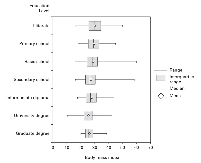
Disease or unhealthy conditions also can be measured on a continuous scale rather than counted directly (e.g., body mass index [BMI], blood lead level, blood hemoglobin, blood sugar, or blood pressure). You can use empirical cutoff points (e.g., BMI ≥26 for overweight). These can then be counted and the rates calculated. However, a person's measurements can fluctuate above or below these cutoff values. To calculate incidence, special care therefore is needed to avoid counting the same person every time a fluctuation occurs above or below the cutoff point. For prevalence, this fluctuation amplifies the statistical error. A more precise approach involves computing the average and dispersion of the individual measurements. These can then be compared among groups, against expected values, or against target values. The averages and dispersions can be displayed in a table or visualized in a box-and-whisker plot that indicates the median, mean, interquartile range, and outliers (see Figure 6.1)5
Time (When?)
Time has special importance in interpreting epidemiologic data in that the initial exposure to a causative agent must precede disease. Often, this will follow a biologically determined interval. The disease or health condition onset time is the preferred statistic for studying time patterns. Onset might not always be available. In surveillance systems, you might have only the report date or another onset surrogate. Moreover, with slowly developing health conditions, a discernable onset might not exist. On the opposite end of the scale, injuries and acute poisonings have instantaneous and obvious onsets.
Similarly, times of suspected exposures vary in their precision. With acute infections, poisonings, and injuries, you will often have precise exposure times to different suspected agents. Contrast this with chronic diseases that can have exposures lasting for decades before development of overt disease. Other relevant events supplementing a chronologic framework of a health problem include underlying environmental conditions, changes in health policy, and application of control and prevention measures.
Relating disease with these events in time can support calculation of key characteristics of the disease or health event. If you know both time of onset and time of the presumed exposure, you can estimate the incubation or latency period. When the agent is unknown, the time interval between presumed exposures and onset of symptoms helps in hypothesizing the etiology. For example, the consistent time interval between rotavirus vaccination and onset of intussusception (Table 6.1) helped build the hypothesis that the vaccine precipitated the disease. 1Similarly, when the incubation period is known, you can estimate a time window of exposure and identify exposures to potential causative agents during that window.
Depicting Data by Time: Graphs
Graphs are most frequently used for displaying time associations and patterns in epidemiologic data. These graphs can include line graphs, histograms (epidemic curves), and scatter diagrams (see Guidelines for Graphical Data Presentation for general guidelines in construction of epidemiologic graphs).
Guidelines for Graphical Data Presentation
- Take care in selecting a graph type in computer graphics programs. In Microsoft Excel (Microsoft Corporation, Redmond, WA), for example, you should use "scatter," not "line" to produce numerically scaled line graphs.
- Adhere to mathematical principles in plotting data and scaling axes.
- On an arithmetic scale, represent equal numerical units with equal distances on an axis.
- When using transformed data (e.g., logarithmic, normalized, or ranked), represent equal units of the transformed data with equal distances on the axis.
- Represent dependent variables on the vertical scale and independent variables on the horizontal scale.
- Use alternatives to joining data points with a line. Consider instead
- No line at all (use data markers only).
- A trend line of best fit underlying the data markers.
- A moving average line underlying the data markers.
- Aspect ratios (data space width to height) of approximately 2:1 work well. Extreme aspect ratios distort data.
- Scale the graph to fill the data space and to improve resolution. If this means that you must exclude the zero level, exclude it, but note for the reader that this has been done.
- Do not insist on a zero level unless it is an integral feature of the data (e.g., an endpoint).
- Use graphic designs that reveal the data from the broad overview to the fine detail.
- To compare two lines, plot their difference directly.
- Use visually prominent symbols to plot and emphasize the data.
- Make sure overlapping plotting symbols are distinguishable.
- When two or more data sets are plotted in the same data space
- Design point markers and lines for visual discrimination; and
- Differentiate them with labels, legends, or keys.
- To avoid clutter and maintain undistorted comparisons, consider using two or more separate panels for different strata on the same graph.
- When comparing two graphs of the same dependent variable, use scaling that improves comparison and resolution.
- Clearly indicate scale divisions and scaling units.
- Minimize frames, gridlines, and tick marks (6–10/axis is sufficient) to avoid interference with the data.
- Use six or fewer tick mark labels on the axes. More than that becomes confusing clutter.
- Keep keys, legends, markers, and other annotations out of the data space. Instead, put them just outside the data region.
- Proofread your graphs.
Contact Diagrams
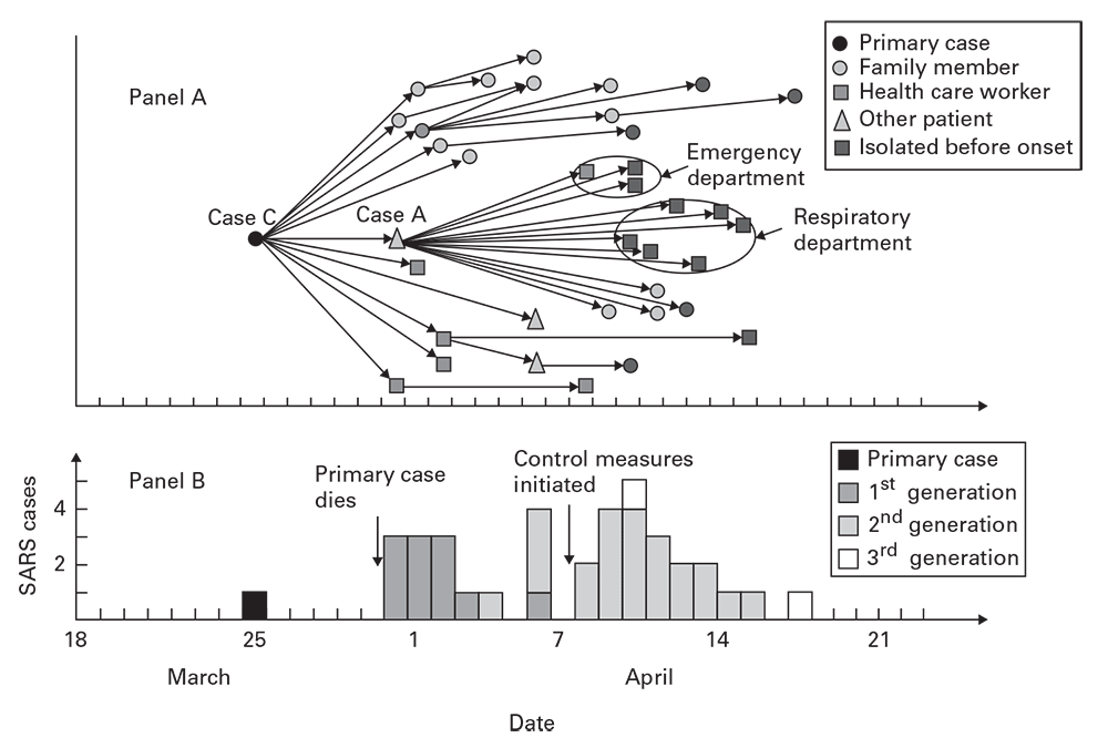
Contact diagrams are versatile tools for revealing relationships between individual cases in time. In contact diagrams (Figure 6.2, panel A), 5which are commonly used for visualizing person-to-person transmission, different markers are used to indicate the different groups exposed or at risk.
Epidemic Curves
Epidemic curves (Guidelines for Epidemic Curve Histograms) are histograms of frequency distributions of incident cases of disease or other health events displayed by time intervals. Epidemic curves often have patterns that reveal likely transmission modes. The following sections describe certain kinds of epidemic situations that can be diagnosed by plotting cases on epidemic curves.
Guidelines for Epidemic Curve Histograms
- Time intervals are indicated on the x-axis and case counts on the y-axis.
- Upright bars in each interval represent the case counts during that interval.
- No gaps should exist between the bars.
- Use time intervals of half an incubation or latency period or less.
- Decrease the time interval size as case numbers increase.
- Indicate an interval of 1–2 incubation periods before the outbreak increases from the background and after it returns to background levels.
- Use separate, equally scaled epidemic curves to indicate different groups.
- Do not stack columns for different groups atop one another in the same graph.
- Use an overlaid line graph, labels, markers, and reference lines to indicate suspected exposures, interventions, special cases, or other key features.
- Compare the association of cases during these pre-and post-epidemic periods with the main outbreak.
Point Source
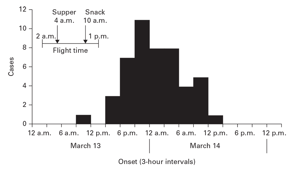
An epidemic curve with a tight clustering of cases in time (≤1.5 times the range of the incubation period, if the agent is known) and with a sharp upslope and a trailing downslope is consistent with a point source (Figure 6.3). 6Variations in slopes (e.g., bimodal or a broader than expected peak) might indicate different ideas about the appearance, persistence, and disappearance of exposure to the source. Of note, administration of antimicrobials, immunoglobulins, antitoxins, or other quickly acting drugs can lead to a shorter than expected outbreak with a curtailed downslope.
To approximate the time of exposure, count backward to the average incubation period before the peak, the minimum incubation period from the initial cases, and the maximum incubation period from the last cases. These three points should bracket the exposure period. If a rapidly acting intervention was taken early enough to prevent cases, discount the contribution of the last cases to this estimation.
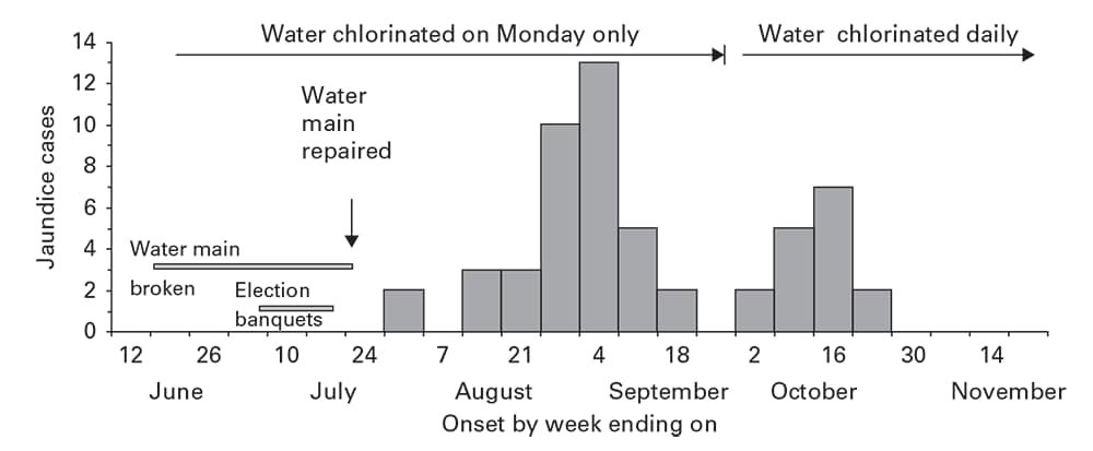
Point source outbreaks result in infected persons who might have transmitted the agent directly or through a vehicle to others. These secondary cases might appear as a prominent wave after a point source by one incubation period, as observed after a point source hepatitis E outbreak that resulted from repairs on a broken water main (Figure 6.4). 7With diseases of shorter incubation and lower rates of secondary spread, the secondary wave might appear only as a more prolonged downslope.
Continuing Common Source
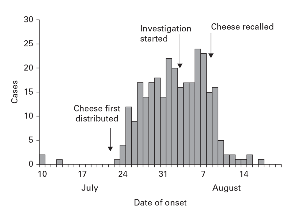
Outbreaks can arise from common sources that continue over time. The continuing common source epidemic curve will increase sharply, similar to a point source. Rather than increase to a peak, however, this type of epidemic curve has a plateau. The downslope can be precipitous if the common source is removed or gradual if it exhausts itself. The rapid increase, plateau, and precipitous downslope all appeared with a salmonellosis outbreak from cheese distributed to multiple restaurants and then recalled (Figure 6.5).
Figure 6.2
Source: Adapted from Reference 5
Figure 6.3
Source: Adapted from Reference 6
Figure 6.4
Source: Adapted from Reference 7
Figure 6.5
Propagated
A propagated pattern arises with agents that are communicable between persons, usually directly but sometimes through an intermediate vehicle. This propagated pattern has four principal characteristics (Characteristics of Propagated Epidemic Curves).
The epidemic curve accompanying the severe acute respiratory syndrome (SARS) contact diagram (Figure 6.2, panel B) illustrates these features, including waves with an approximate 1-week periodicity. Certain behaviors (e.g., drug addiction or mass sociogenic illness) might propagate from person to person, but the epidemic curve will not necessarily reflect generation times. Epidemic curves for large geographic areas might not reveal the early periodicity or the characteristic increase and decrease of a propagated outbreak. For these larger areas, stratifying the epidemic curves by smaller subunits can reveal the underlying periodicity.
Characteristics of Propagated Epidemic Curves
- They encompass multiple generation periods for the agent.
- They begin with a single or limited number of cases and increase with a gradually increasing upslope.
- Often, a periodicity equivalent to the generation period for the agent might be obvious during the initial stages of the outbreak.
- After the outbreak peaks, the exhaustion of susceptible hosts usually results in a rapid downslope.
Human–Vector–Human
Vectorborne diseases propagate between an arthropod vector and a vertebrate host. Six biologic differences in human–vector–human propagation affect the size and the shape of the epidemic curve (Factors Affecting Patterns of Human–Vector–Human Transmission Across Time). The last two factors listed in the box will lead to irregular peaks during the progression of the outbreak and precipitous decreases.
An outbreak of dengue arising from a single imported case in a South China town reveals several of these features (Figure 6.6). After the initial case, 15 days elapsed until the peak of the first generation of new cases. Control measures targeting the larva and adults of the mosquito vectors Aedes aegypti and A. albopictus began late in the first generation. The line indicates the rapid decrease in Aedes-infested houses (house index). A rapid decrease in dengue cases follows this decrease in vector density.
Factors Affecting Patterns of Human–Vector–Human Transmission Across Time
- Arthropod vectors feed indiscriminately. Contrast this with human social interactions that govern person-to-person transmission. Sequential waves of human–vector–human transmission tend to be larger than person-to-person transmission.
- Generation periods between waves of an outbreak are usually longer than with simple person-to-person transmission because two sequential incubation periods, extrinsic in the vector and intrinsic in the human, are involved.
- Arthropod vectors, after becoming infected, remain so until they perish. This tends to prolong waves of vectorborne outbreaks.
- Increasing environmental temperatures accelerate the multiplication of infectious agents in an arthropod. Consequently, they also accelerate and amplify epidemic development.
- Mean daily temperatures of less than 68ºF (<20ºC) typically arrest multiplication of infectious agents in the arthropod.
- Arthropod populations can grow explosively and can decline even more rapidly. This will be reflected by an instability of the epidemic curve.
Zoonotic
The epidemic curve for a zoonotic disease among humans typically mirrors the variations in prevalence among the reservoir animal population. This will be modified by the variability of contact between humans and the reservoir animal and, for vectorborne zoonoses, contact with the arthropod vector.
Environmental
Epidemic curves from environmentally spread diseases reflect complex interactions between the agent and the environment and the factors that lead to exposure of humans to the environmental source. Outbreaks that arise from environmental sources usually encompass multiple generations or incubation periods for the agent. You should include on the epidemic curve a representation of the suspected environmental factor (e.g., rainfall connected with leptospirosis in Figure 6.7). 8In this example, nearly every peak of rainfall precedes a peak in leptospirosis, supporting the hypothesis regarding the importance of water and mud in transmission.
Relative Time
As an alternative to plotting onset by calendar time, plotting the time between suspected exposures and onset can help you understand the epidemiologic situation. For example, a plot of the days between contact with a SARS patient and onset of SARS in the person having contact indicates an approximation of the incubation period (Figure 6.8).
Multiple Strata Display
To reveal distinctive internal patterns (e.g., by exposure, method of case detection, place, or personal characteristics) in time distributions, epidemic curves should be stratified (Figure 6.9). This puts each stratum on a flat baseline, enabling undistorted comparisons. Stacking different strata atop one another (as in Figure 6.7, which is not recommended) defeats attempts to compare the time patterns by group.
Figure 6.6
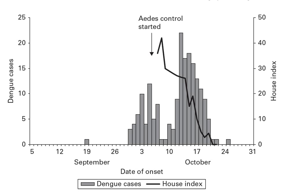
Source: Adapted from Reference 9
Figure 6.7
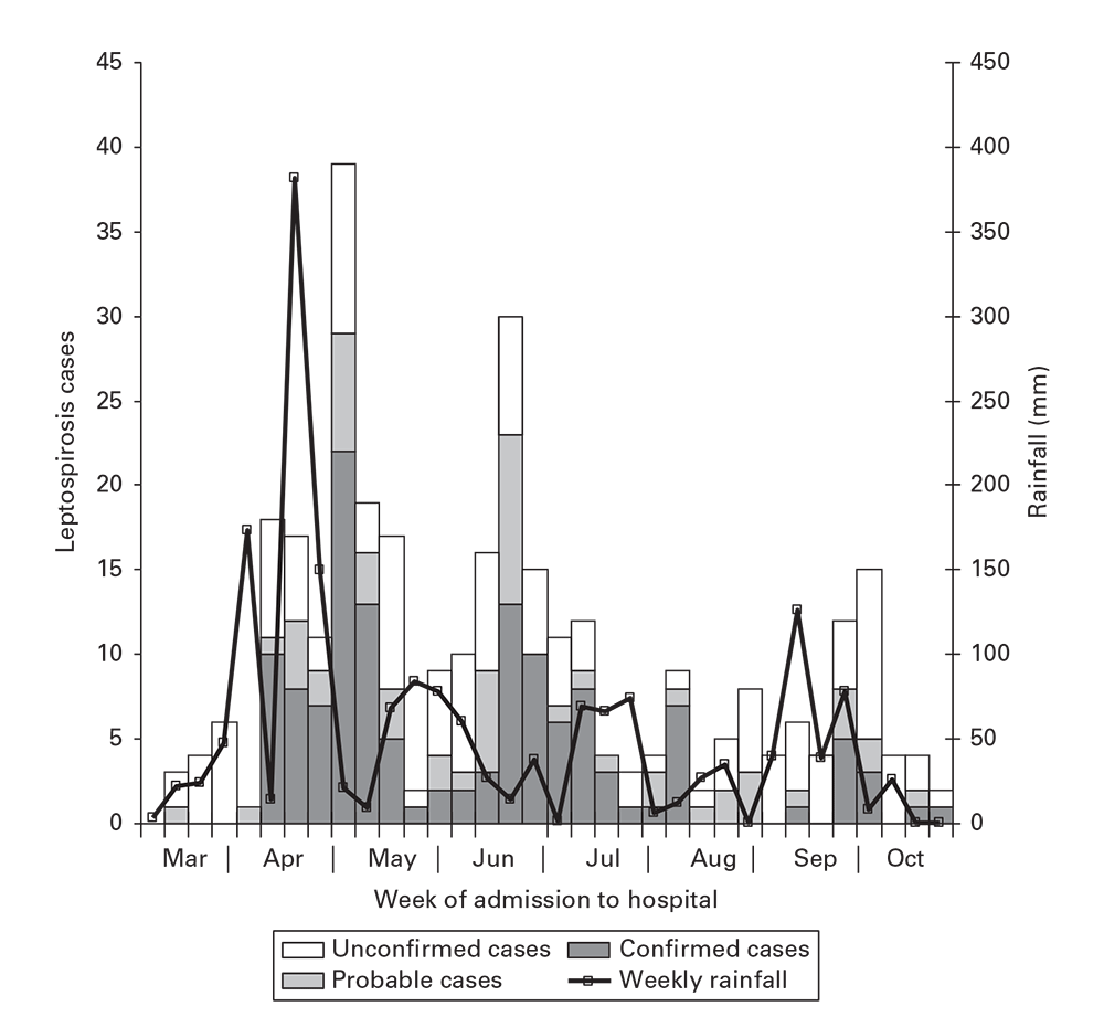
Source: Adapted from Reference 8
Figure 6.8
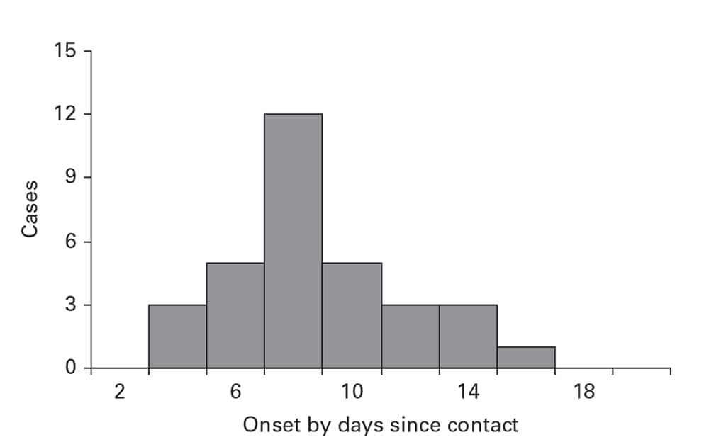
Source: Adapted from Reference 5
Figure 6.9
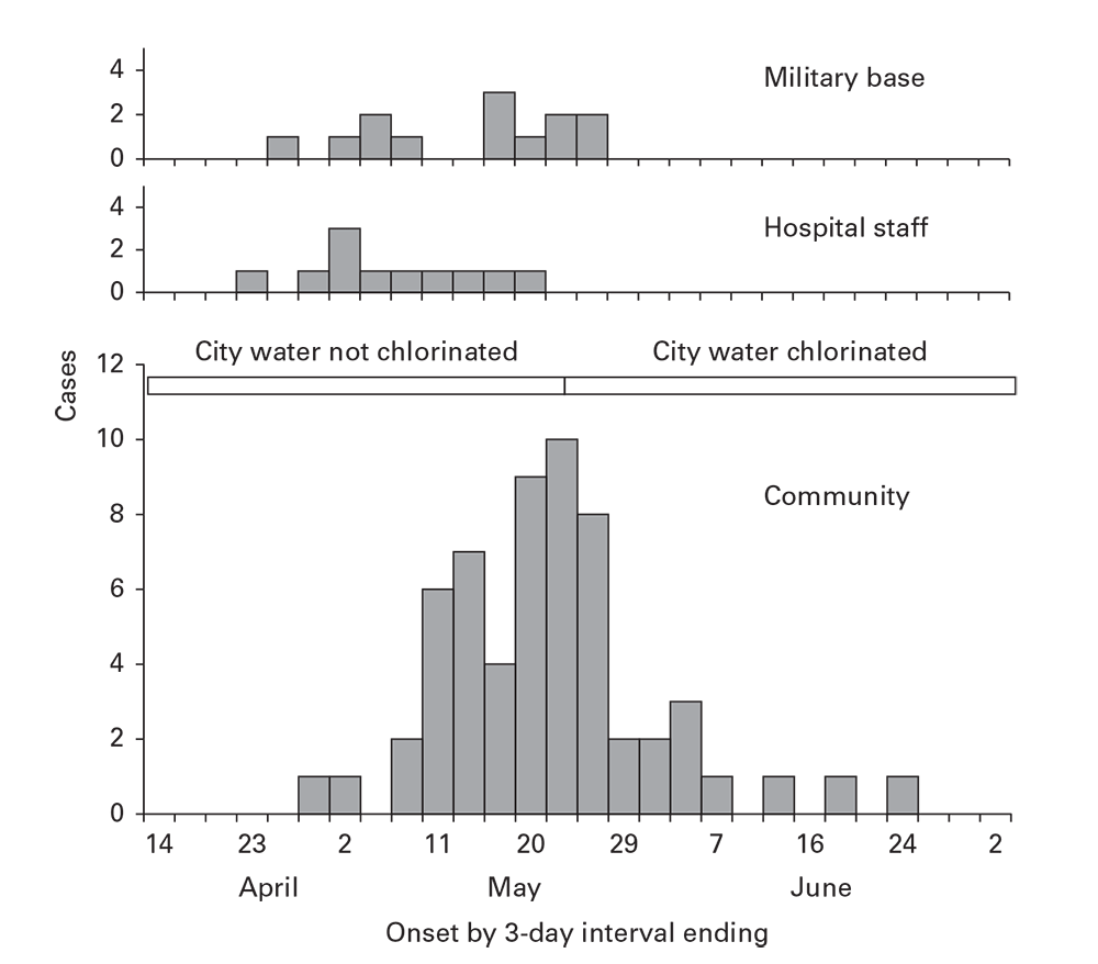
Examining Rates by Time
Temporal disease rates are usually illustrated by using a line graph (Guidelines for Graphical Data Presentation). The x-axis represents a period of interest. The y-axis represents the rate of the health event. For most conditions, when the rates vary over one or two orders of magnitude, an arithmetic scale is recommended. For rates that vary more widely, a logarithmic scale for the y-axis is recommended for epidemiologic purposes (Figure 6.10). 10You should also use a logarithmic scale for comparing two or more population groups. Equal rates of change in time (e.g., a 10% decrease/year) will yield misleading, divergent lines on an arithmetic plot; a logarithmic scale will yield parallel lines.
Secular Trend
For most conditions, a time characteristic of interest is the secular trend—the rate of disease over multiple years or decades. Secular trends of invasive cervical cancer (Figure 6.11) reveal steady decreases over 37 years. 11New health policies in 1970 and 1995 that broadened coverage of Papanicolaou smear screenings for women were initially followed by steeper decreases and subsequent leveling off of the downward trend. This demonstrates how review of secular trends can bring attention to key events, improvements in control, changes in policy, sociologic phenomena, or other factors that have modified the epidemiology of a disease.
Seasonal and Cyclical Patterns
For certain conditions, a description by season, month, day of the week, or even time of day can be revealing. Seasonal patterns might be summarized in a seasonal curve (Seasonal Curves). Stratifying seasonal curves can further expose key differences by place, person, or other features (Figure 6.12). 12
Seasonal Curves
- Use multiple years (≥5) of data.
- Summarize with average rates, average counts, or totals for all the Januarys, Februarys, and so on for each of the 12 months.
- Use other intervals (e.g., weeks or days) accordingly.
- Plot the rate, average, or total for each interval on a histogram or line graph.
- Plot the percentage of the total for the year represented by each interval; however, take care when interpreting the total percentage.
- Use redundant beginning and end points (see Figures 6.9 through 6.14) to visualize the trend between the last and first months of the cycle.
- This type of curve can be made for any time cycle (e.g., time of day, day of week, or week of influenza season).
Figure 6.10
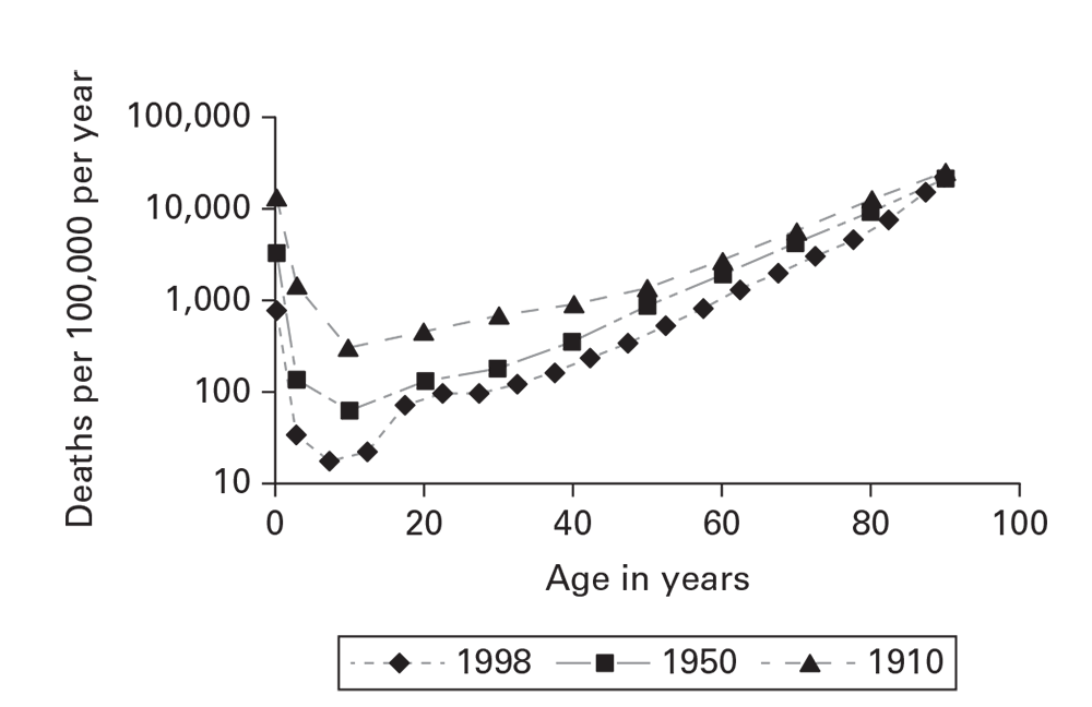
Source: Adapted from Reference 10
Figure 6.11
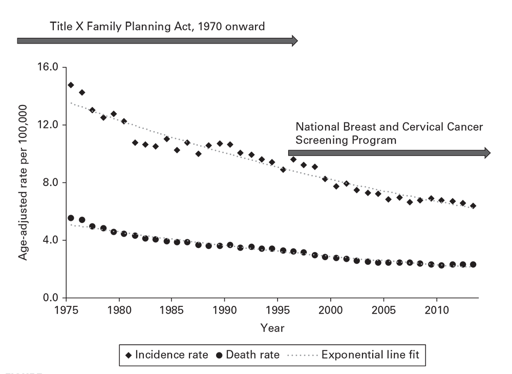
Source: Adapted from Reference 11
Figure 6.12
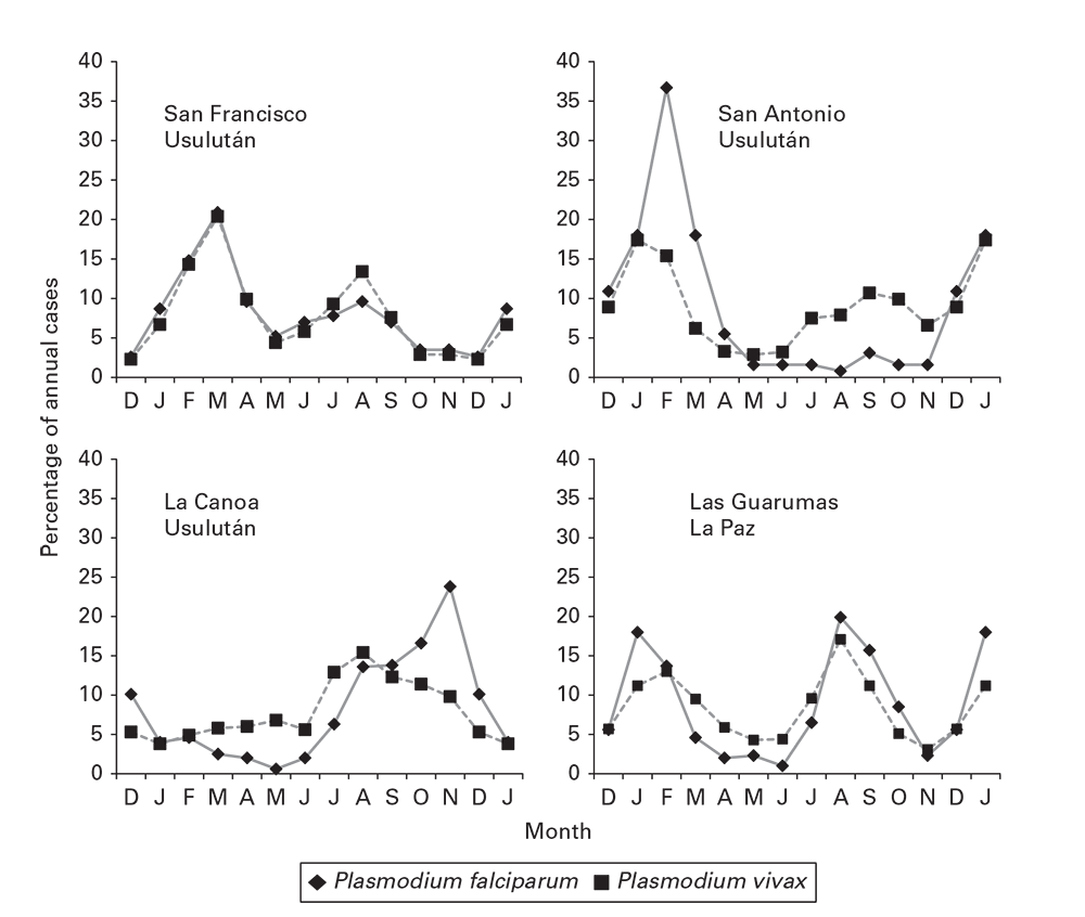
Source: Adapted from Reference 12
Examining Data By Place (Where?)
When creating graphics and interpreting distributions of disease by place, keep in mind Waldo Tobler's first law of geography: "Everything is related to everything else, but near things are more related than distant things." 13These distance associations of cases or rates are best understood on maps. In addition, maps display a wealth of underlying detail to compare against disease distributions. In creating epidemiologic maps, you should follow certain basic guidelines (See Guidelines Regarding Data Display Area of Epidemiologic Maps).
Information about place of affected persons might include residence, workplace, school, recreation site, other relevant locales, or movement between fixed geographic points. Distinguish between place of onset, place of known or suspected exposure, and place of case identification. They are often different and have distinct epidemiologic implications. Information about place can range in precision from the geographic coordinates of a residence or bed in a hospital to simply the state of residence. Because population estimates or censuses follow standard geographic areas (e.g., city, census tract, county, state, or country), determination of rates is also restricted to these same areas.
Guidelines Regarding Data Display Area Of Epidemiologic Maps
- Indicate scaling as a ratio (e.g., 1:100,000), a scale bar (e.g., a 1-cm bar = 50 m), or tick marks on the x-and y-axes (indicating linear distance or longitude and latitude).
- On maps representing land areas, indicate longitude and latitude and orientation (i.e., by using a northward-pointing arrow).
- Ensure that scaling applies accurately to all features in the map area, especially indicators of location of disease and potential exposures.
- Reduce embellishments that obstruct a clear vision of disease and potential exposures. These might include detailed administrative boundaries or a longitude-latitude grid.
Spot Maps
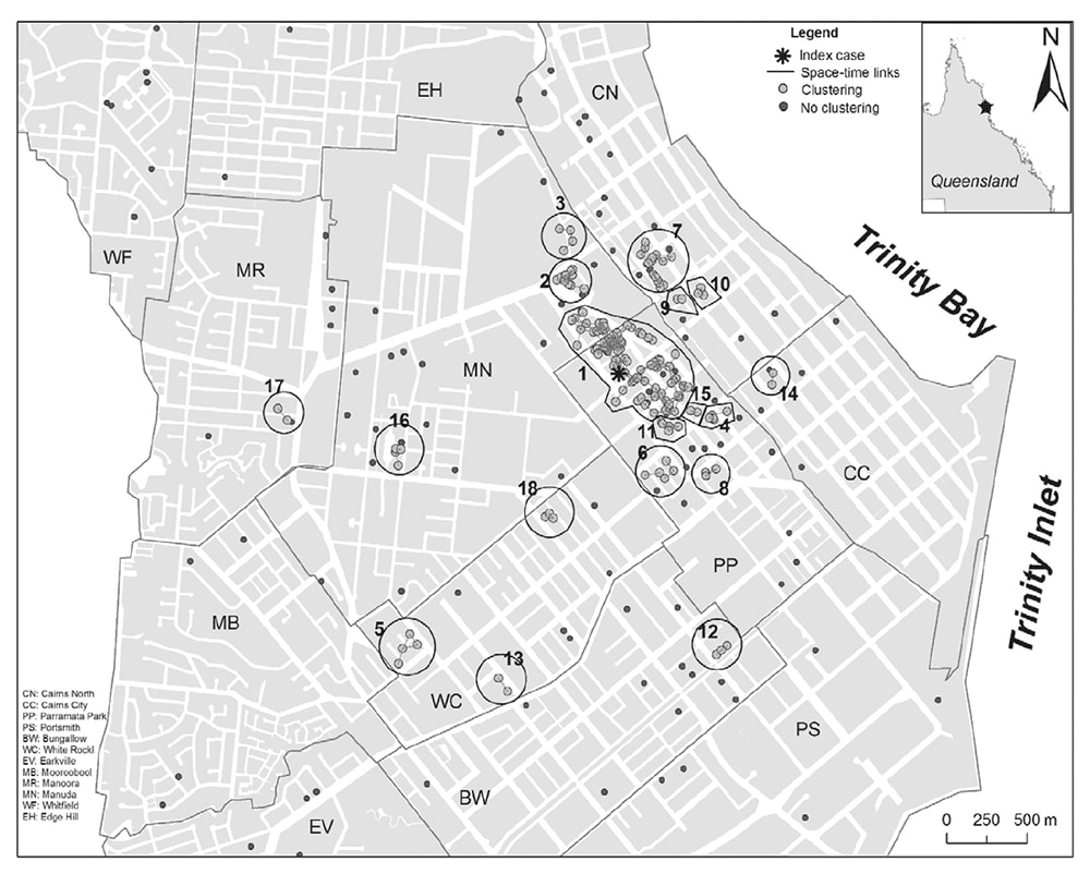
Use spot maps to reveal spatial associations between cases and between cases and geographic features. Cases can be plotted on a base map (Figure 6.13), 14a satellite view of the area, a floor plan, or other accurately scaled diagram to create a spot map. Dots, onset times, case identification numbers for indexing with a line listing, or other symbols might represent disease cases (Data Portrayal On Epidemiologic Maps). The example spot map of a dengue outbreak uses larger dots to represent cases clustered in time and space and numbers these clusters to reference to a table (not shown). It reveals the location of the first case in the business district and the large initial cluster surrounding it (Figure 6.13). 14Cases not included in clusters are marked with smaller dots. These are widely dispersed, indicating that they did not acquire their infection from their local environs.
You might also use spot maps to represent affected villages, towns, or other smaller population units. If the denominator of the population unit is known, spots of different size or shading (Data Portrayal On Epidemiologic Maps) can represent rates or ratios.
Spot maps that plot cases have a general weakness. The observed pattern might represent variability in the distribution of the underlying population. When interpreting spot maps, keep in mind the population distribution with particular attention to unpopulated (e.g., parks, vacant lots, or abandoned warehouses) or densely populated areas.
Area Maps and Rates
Rates are normally displayed on area maps (e.g., patch or choropleth). The map is divided into population enumeration areas for which rates or ratios can be computed. The areas are then ranked into strata by the rates, and the strata are shaded (Data Portrayal On Epidemiologic Maps) according to the magnitude of the rate.
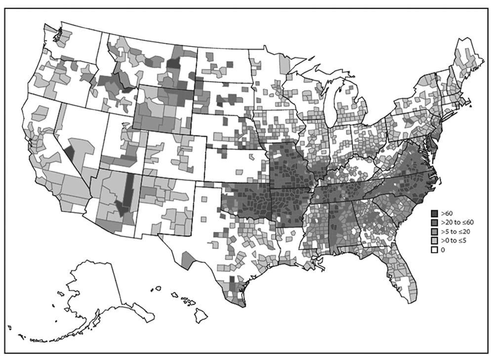
Compute and plot rates for the smallest area possible. For example, the map of spotted fever rickettsioses in the United States effectively displays multiple levels of risk for human infection (Figure 6.14). 15Avoid using area maps to display case counts. Plotting only numerators loses the advantage of both the spot map (indicating exact location and detailed background features) and the area map (indicating rates).
Data Portrayal On Epidemiologic Maps
Spot Maps
- Place all spots accurately.
- Ensure that overlapping spots are distinguishable.
- Ensure that potential exposures are easily discerned and labeled.
- Indicate underpopulated or depopulated areas.
- Highlight high-interest cases.
Area (Patch or Choropleth) Maps
- To indicate numeric intensity, use increasing intensity of gray from white to black. If using color, use increasing intensities of the same hue.
- To indicate divergence from an average range, use white for the center range and deepening intensities of two different hues for divergent strata on opposite extremes.
- To indicate nominative (non-numeric) qualities, use different hues or fill patterns.
- To indicate no data, use a different hue or fill pattern.
- Let the difference in shading of map areas define and replace detailed internal boundary lines.
- Include a legend or key to clarify map features (e.g., disease cases, rates, and exposures).
- Consider indicating the zero-level separately.
- Indicate the data range in the legend; do not leave it open-ended.
- Create multiple maps to indicate associations of cases to different background features to fully communicate the geographic association between disease and exposure.
- Use the smallest possible administrative area that the numerator and denominator will allow.
Scatter Plots
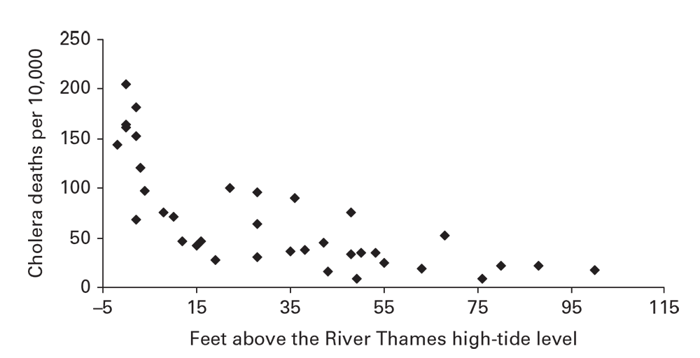
Scatter plots are versatile instruments for exploring and communicating data. They indicate the association between two numerically scaled variables (Figure 6.15). 16Each spot in the plotting area represents the joint magnitude of the two variables. As a convention in plotting epidemiologic or geographic association, the explanatory variable (exposure, environmental, or geographic) is plotted on the x-axis, and the outcome (rate or individual health measurement [e.g., BMI]) is plotted on the y-axis.
When the pattern of the spots forms a compact, linear pattern, suspect a strong association between the two variables. In Figure 6.15, a distinctive pattern of rapidly increasing cholera death rates is apparent as the altitude approaches the level of the River Thames. This reveals that factor and that an environmental exposure also related to low altitude (e.g., poor drainage of sewage) might have contributed to cholera incidence.
Figure 6.13
Source: Adapted from Reference 14
Figure 6.14
Source: Adapted from Reference 14
Figure 6.15
Person (Among Whom?)
Recognizing disease patterns by personal attributes (e.g., age, sex, education, income, or immunization status) constitutes the fifth element in descriptive epidemiology. Two important qualifications apply to person data assessments. First, determining rates is more often necessary than for time and place. Second, age is a strong independent determinant for many causes of morbidity and mortality.
Social Groupings and Personal Contact
Social groupings might be as compact as a household or as diffuse as a social network linked by a common interest. The underlying epidemiologic process might produce disease distributions within and among social groupings that range from strong aggregation to randomness or uniformity. Clustered distributions might result from common exposures of group members, an agent that is transmissible through personal contact, an environmental exposure in the living or meeting areas, or localization of houses near or within an environmental area of high risk. Random or uniform distributions indicate that the exposure lies outside the group.
For diseases or behaviors spread through personal contact or association, contact diagrams reveal the pattern of spread plus such key details as index cases and outliers. In the example diagram, closeness and quality of relationships, timing between onsets, and places of contact are all displayed through different symbols and shading (Figure 6.2). 5To support person-to-person transmission, you should also see that the timing between onsets of cases approximates the known incubation periods for the disease (Figure 6.8). 5
Age
In most descriptive analyses, the epidemiologist will determine disease rates by age. This can be as simple as finding that a health event is affecting only a limited age group or as complicated as comparing age-specific rates among multiple groups. Age represents three different categories of determinants of disease risk (Three General Interpretations of Age Distributions). Because age is a pervasive determinant of disease and because population groups often differ in their age structures, age adjustment (standardization) is a useful tool for comparing rates between population groups. 17Age-adjusted rates can be used for comparing populations from different areas, from the same area at different times, and among other characteristics (e.g., ethnicity or socioeconomic status).
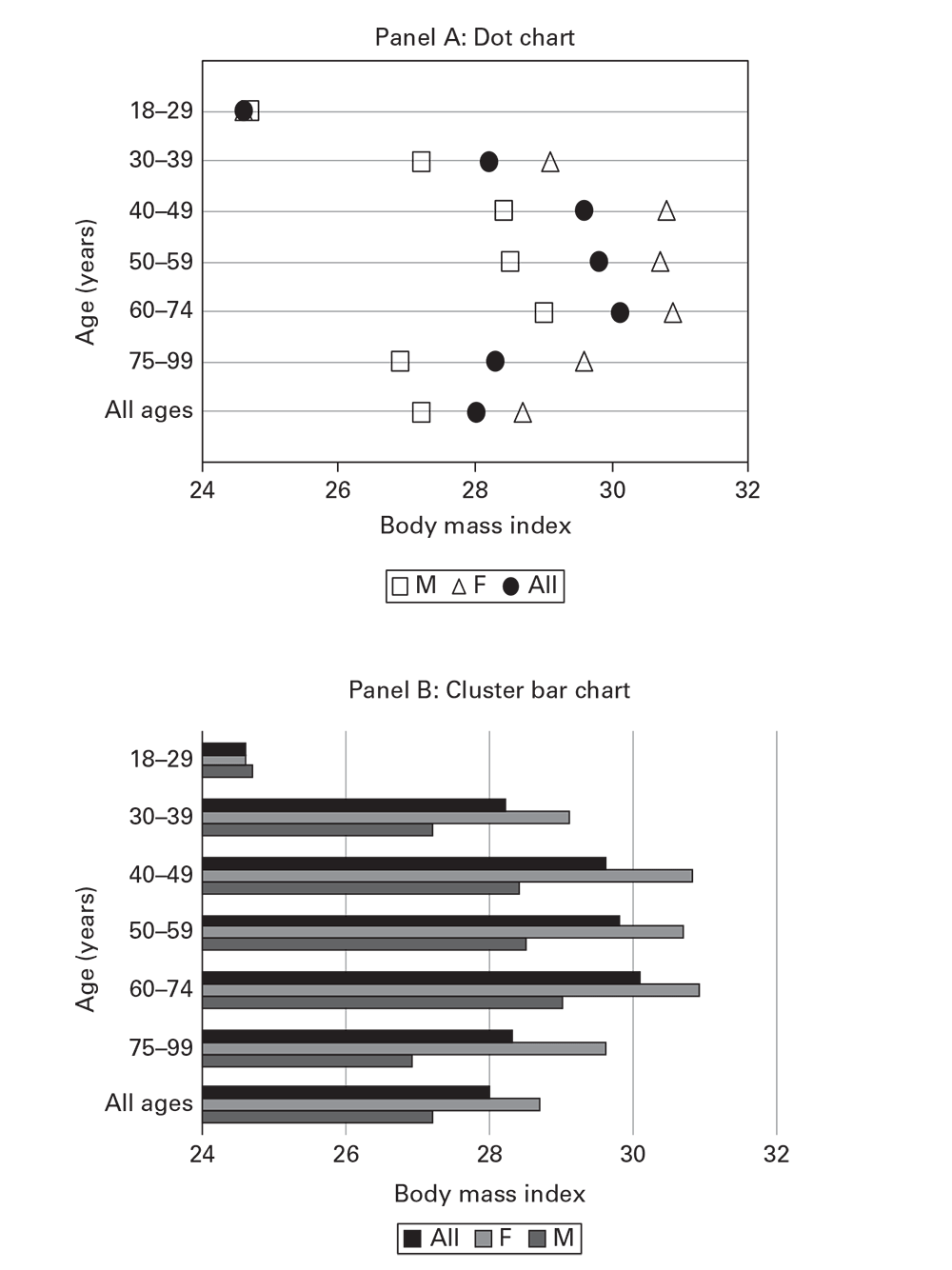
An analysis of BMI by age from Ajloun and Jerash Governorates, Jordan, draws attention to increasing BMI and accumulating overweight prevalence for persons aged 18–75 years (Table 6.3) (Ajloun Non-Communicable Disease Project, Jordan, unpublished data, 2017). As an alternative to using tables, charts (Guidance Regarding Preparing Charts) (e.g., dot charts) (Figure 6.16, panel A) or horizontal cluster bar charts (Figure 6.16, panel B) improve perception of the patterns in the data, compared with a table. Cluster bar charts with more than two bars per cluster (e.g., Figure 6.16, panel B) are not recommended.
Three General Interpretations of Age Distributions
- The condition of the host and its susceptibility to disease. Persons of different ages often differ in susceptibility or predisposition to disease. Age is one of the most important determinants of chronic diseases, many infectious diseases, and mortality.
- Differing intensities of exposure to causative agents.
- The passage of time. Older persons have had greater overall time of exposure or might have been exposed at different periods when background exposures to certain agents were greater. A disease with a long latency period (e.g., tuberculosis) might reflect exposures decades in the past.
Guidance Regarding Preparing Charts
- Charts present statistical information comparing numeric values for sets of multiple nominative characteristics or grouped numeric characteristics.
- Data presentation is interchangeable with tables. The choice between tables and charts depends on the purpose, the audience, and the complexity of the data.
- The best charts for quick and accurate understanding are dot plots, box-and-whisker plots, and simple bar charts.
- Avoid pie charts, cluster bar charts, stacked bar charts, and other types not presented in this chapter.
- Dot plots, box plots, and bar charts are easier to understand and read if aligned horizontally (with the numeric axis horizontal).
- Sorting nominative categories by the magnitude of the numeric value helps the reader's understanding. If the classification variable is numeric (e.g., age group), sort by the numeric category.
- The dot chart is the most versatile and the easier to understand, particularly as categories increase in number.
- Dot and box-and-whisker charts are plotted against a numeric scale and thus do not need a zero level.
- Bar charts usually need a zero level because viewers judge magnitude by the length of the bar.
Other Personal Attributes
Analysis by other personal attributes in descriptive epidemiology involves comparing rates or other numeric data by different classes of the attribute. For example, overweight prevalence in the Ajloun data can be compared by using different education levels. A more precise approach to estimating how much for measurements on a continuous scale, discussed earlier in this chapter, might be to compute the average and dispersion of the individual BMI measurements, as shown on a box-and-whisker plot (Figure 6.1).
Figure 6.16
Source: Adapted from Ajloun Non-Communicable Disease Project, Jordan, unpublished data, 2017.T
Table 6.3
- Ehrenberg AC. The problem of numeracy. Am Stat. 1981;35:67–71.
- Centers for Disease Control and Prevention. Intussusception among recipients of rotavirus vaccine—United States, 1998–1999. MMWR. 1999;48:577–81.
- Hawley B, Casey ML, Cox-Ganser JM, Edwards N, Fedan KB, Cummings KJ. Notes from the field: respiratory symptoms and skin irritation among hospital workers using a new disinfection product—Pennsylvania, 2015. MMWR. 2016;65:400–1.
- Centers for Disease Control and Prevention. Injuries and deaths associated with use of snowmobiles—Maine, 1991–1996. MMWR. 1997;46:1–4.
- Xie S, Zeng G, Lei J, et al. A highly efficient transmission of SARS among extended family and hospital staff in Beijing, China, April 2003. Presented at the 2nd Southeast Asian and Western Pacific Bi-Regional TEPHINET Scientific Conference, November 24–28, 2003, Borocay, Philippines.
- Tauxe RV, Tormey MP, Mascola L, Hargrett-Bean NT, Blake PA. Salmonellosis outbreak on transatlantic flights; foodborne illness on aircraft: 1947–1984. Am J Epidemiol. 1987;125:150–7.
- Abu-Sbeih A, Fontaine RE. Secondary water-borne hepatitis E outbreak from water storage in a Jordanian town [abstract LB01]. Presented at the TEPHINET 2000 First International Conference, April 17–21, 2000, Ottawa, Canada.
- Ko AI, Galvao Reis M, Ribeiro Dourado CM, Johnson WD, Jr., Riley LW. Urban epidemic of severe leptospirosis in Brazil. Salvador Leptospirosis Study Group. Lancet. 1999;354:820–5.
- Dou F, Sun H, Wang ZJ. Dengue outbreak at a fishing port: Guangdong Province, China, 2007. Presented at the International Conference on Emerging Infectious Diseases, March 16–19, 2008, Atlanta, Georgia.
- Centers for Disease Control and Prevention, National Center for Health Statistics. National Vital Statistics System. Death rates for selected causes by 10-year age groups, race, and sex: death registration states, 1900–32, and United States, 1933–98. https://www.cdc.gov/nchs/nvss/mortality/hist290.htm
- National Institutes of Health, National Cancer Institute, Surveillance Epidemiology, and End Results Program. SEER*Explorer. http://seer.cancer.gov/explorer/
- Fontaine RE, van Severin M, Houng A. The stratification of malaria in El Salvador using available malaria surveillance data [Abstract 184]. Presented at the XI International Congress for Tropical Medicine and Malaria, September 16–22, 1984, Calgary, Alberta, Canada.
- Tobler W. A computer movie simulating urban growth in the Detroit region. Econ Geogr. 1970;46(Suppl):234–40.
- Vazquez-Prokopec GM, Kitron U, Montgomery B, Horne P, Ritchie SA. Quantifying the spatial dimension of dengue virus epidemic spread within a tropical urban environment. PLoS Negl Trop Dis. 2010;4:e920.
- Biggs HM, Behravesh CB, Bradley KK, et al. Diagnosis and management of tickborne rickettsial diseases: Rocky Mountain spotted fever and other spotted fever group rickettsioses, ehrlichioses, and anaplasmosis—United States. MMWR Recomm Rep. 2016;65(No. RR-2):1–44.
- Registrar-General. Report on the mortality of cholera in England 1848–49. London, UK: Her Majesty's Stationery Office; 1852.
- Fleiss JC. Statistical methods for rates and proportions. New York: John Wiley & Sons; 1981.
